Role: UX/UI Designer | // Timeline: 3 Days // Team: Moonrock
// Brand Experience //
Project Overview
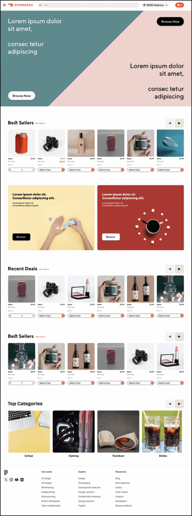
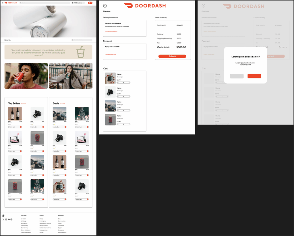
This project involved designing a concept website for a Fortune 500 company to present our vision for a next generation online marketplace built directly within Discord. The objective was to communicate a modern and forward thinking brand identity while preserving the company’s established material design language. The result is a refined and interactive web experience that connects community engagement with ecommerce functionality.
Branding
The project was modeled after DoorDash’s visual system and branding standards. Because this was a client directed contract, initial qualitative and quantitative research was not required.
The primary objective was to design a clean and modern website that adhered strictly to DoorDash’s established material design guidelines. This included using the company’s proprietary color palette and custom iconography.
// User Interface //
Qualitative analysis
The target demographic for this project was Discord users, specifically those between the ages of 25 and 34. Since the concept was designed to integrate within the Discord platform, it was important to align the visual language and interaction style with Discord’s modern and minimal aesthetic. At the same time, the design drew inspiration from DoorDash’s approachable and dynamic brand identity.
Balancing these two styles allowed the product to resonate with its primary audience of mid 20s to early 30s gamers while maintaining a sleek, familiar, and engaging user experience.
// User Interface //
Ideation
Due to the time constraints of the contract, the ideation and mockup phases were expedited to meet the project deadline.
The primary objective was to design a functional marketplace that aligned with the core principles and visual identity of DoorDash while maintaining consistency with its established design system.
User Flow & User Journey
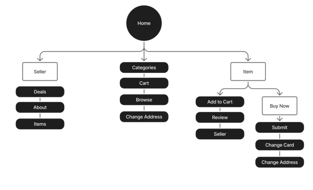
Marketplaces often contain a wide range of pages and interactive elements, so maintaining a clear visual hierarchy and straightforward navigation was essential.
The user journey was intentionally designed to be simple and intuitive, allowing users to reach most pages within two clicks. Repetitive sections were streamlined to improve consistency and reduce cognitive load, resulting in a cleaner, more efficient experience.
Design Outcome
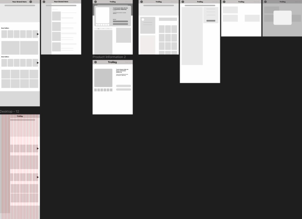
The wireframe was constructed using a 12-column grid with 60 px margins and 20 px gutters, which is a standard layout commonly used in DoorDash and its related web properties.
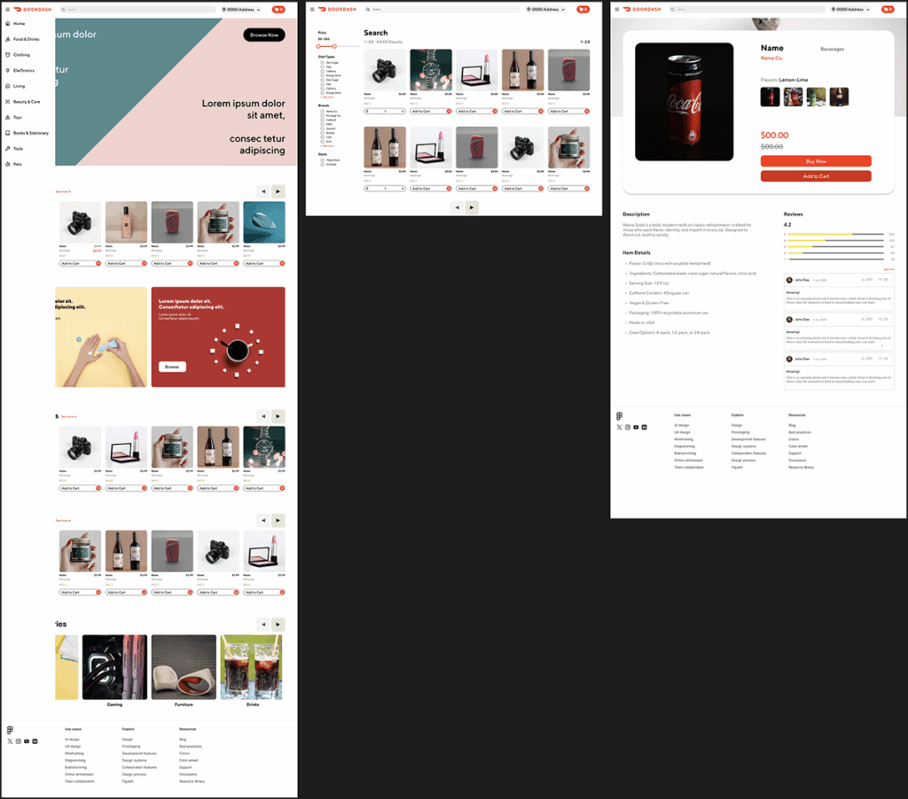
The marketplace design adopted a more modern interpretation to appeal to the target audience of Discord users. Special attention was given to key areas such as product reviews and category selections to ensure they were both visually prominent and easy to access, maintaining a balance between structure, usability, and aesthetic appeal.
Final Design