Role: UX/UI Designer | // Timeline: 1 Week // Team: Independent
This is a self-initiated concept project created for portfolio purposes. It is not affiliated with or endorsed by Epic Games. The redesign reflects personal exploration and suggestions for improving user experience.
// Brand Experience //
Project Overview
Epic Games is an entertainment Industry with the specific pursuit in Video Games. They help developers develop, upload, and operate games helping distribute said games to a wide platform of Gamers.
They are also responsible for developing hit game “Fortnite” and have continued to cement themselves as a giant in the video game industry. However, as of current times, another video game company, Steam, with the same objective have been at the forefront of this section for many years.
Design Challenge
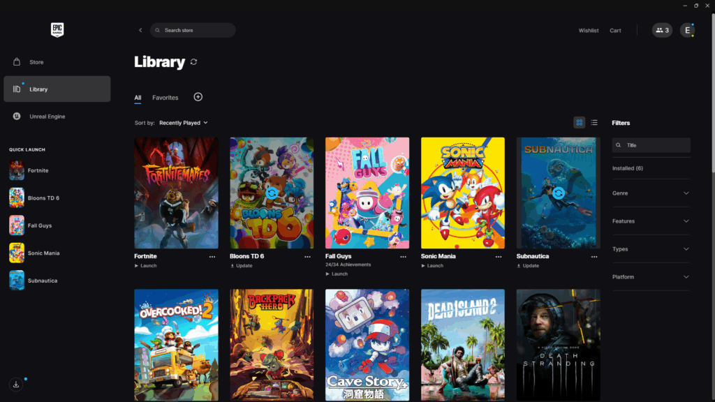
Despite Epic Games’ status as a major player in the gaming industry, the user experience of their desktop launcher suffers from design issues.
The platform struggles with poor visual hierarchy, making it difficult for users to quickly identify important actions or content. Additionally, key user journeys such as launching a game, browsing a library, or discovering new titles are lacking leading to users needing to click more times than needed.
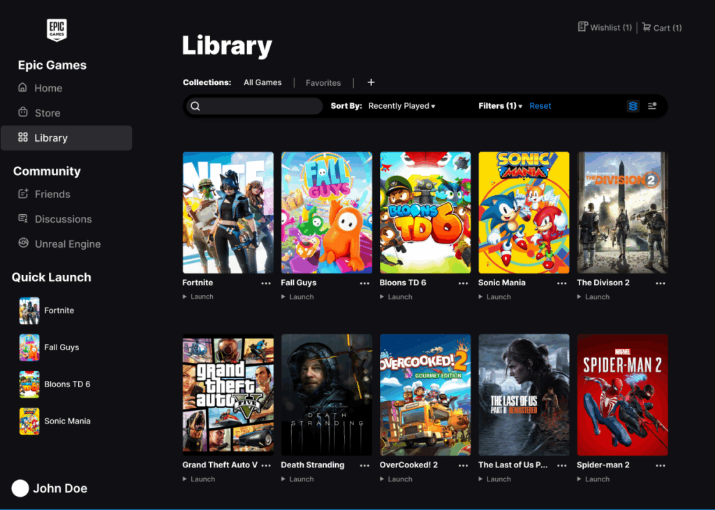
This project focuses on redesigning the Epic Games Library to improve usability and reduce friction in everyday interactions. The goal is to create a cleaner, more intuitive layout that highlights the most important user actions and enhances the overall browsing and discovery experience.
Compromise
At first, the goal was to redesign every page within the Epic Games launcher. However, I soon realized that the objective was not just to make the interface look better, it was to make it more intuitive and user friendly.
From a UX perspective, the areas that required the most attention were the Library and the side navigation column, where usability issues most directly affected how players accessed and managed their games.
Material Design

Epic Games primarily uses a sans serif typeface similar in appearance to the Inter family, chosen for its clarity and versatility across digital interfaces.
The platform’s color palette is built around a dark theme, featuring a near black tone with subtle gray and blue undertones to emphasize selected icons and interactive elements. This is contrasted by pure white text and highlights, maintaining strong visual balance and readability within the launcher’s default dark mode environment.
// Experience System //
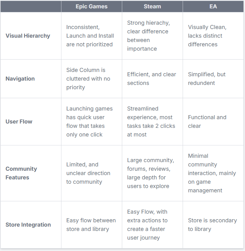
Competitive Analysis
Qualitative Insights
Participants
- 6 Individuals
- ages 16-30
- Casual to Avid Gamers
To better understand user behavior and preferences, I conducted interviews with six participants who actively play or engage with games across multiple platforms. Each participant was asked to compare their experiences using the game libraries of Epic Games, Steam, and EA App.
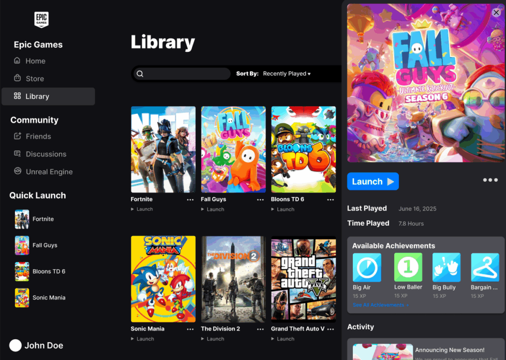
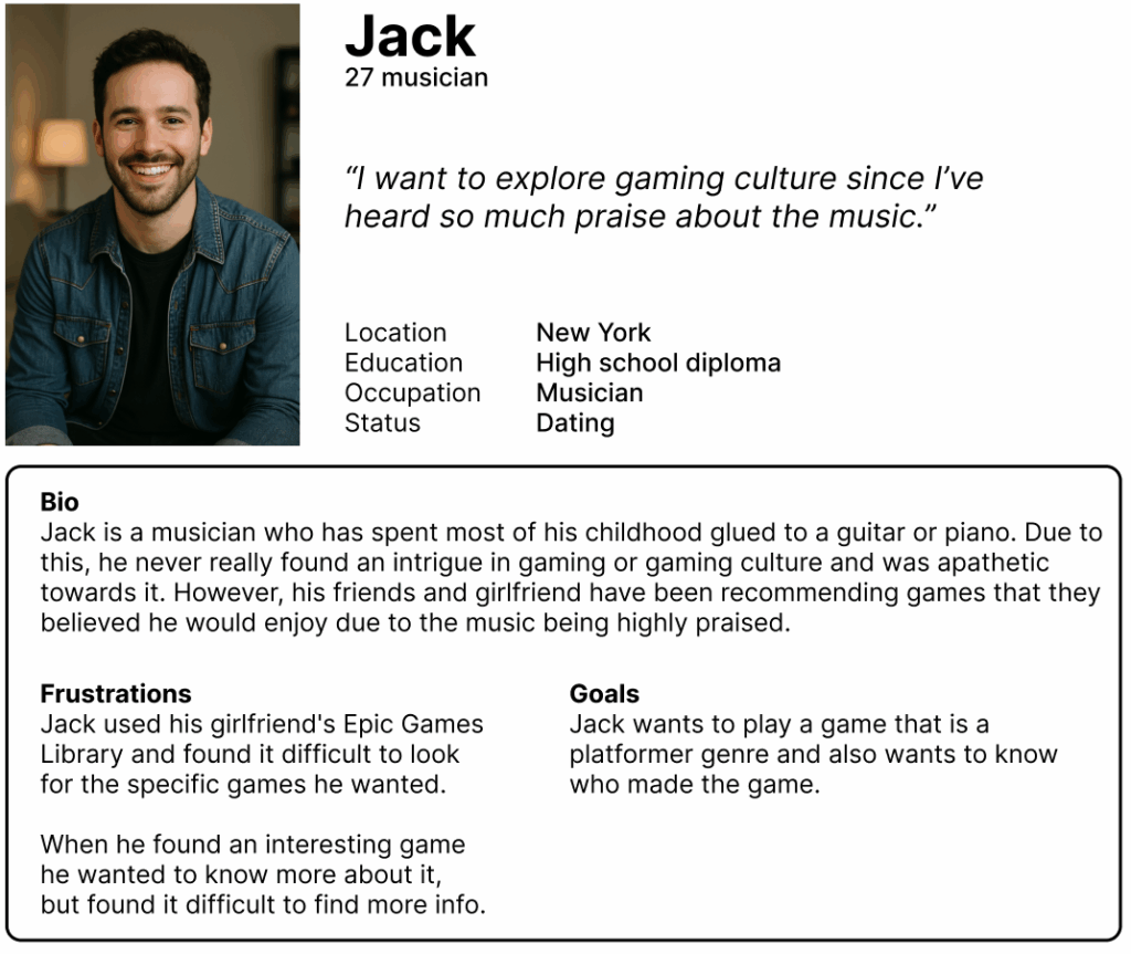
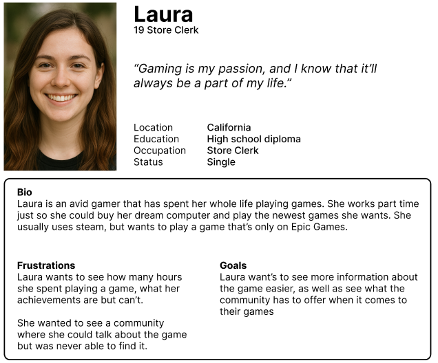
Most participants quickly noted that the Epic Games Library felt unintuitive and visually lacking especially when compared to competitors. They emphasized the lack of accessible information for each game, such as playtime, achievements, or update details, which made it harder to manage or browse their collections effectively. In contrast, Steam was consistently praised for its clear structure, detailed information hierarchy, and ease of navigation.
Participants appreciated how efficiently they could launch, organize, and explore new titles. EA App received neutral feedback, unctional but unremarkable. These insights revealed that Epic’s main pain points center around usability and information visibility, guiding this redesign toward a more player centered experience.
Persona #1
Persona #2
// User Interface //
Ideation
It was important to maintain consistency with the original material design language established by Epic Games. This meant preserving the brand’s core typography, color system, and iconography to ensure that the redesign felt authentic and aligned with the company’s established visual identity.
Rather than reinventing the interface, the goal was to refine and clarify it, simplifying navigation, improving hierarchy, and creating a more seamless interaction flow without disrupting the brand’s recognizable look and feel. By staying faithful to Epic’s existing design framework, the new layout could focus on enhancing usability and clarity while still feeling unmistakably Epic Games.
User Flow & User Journey
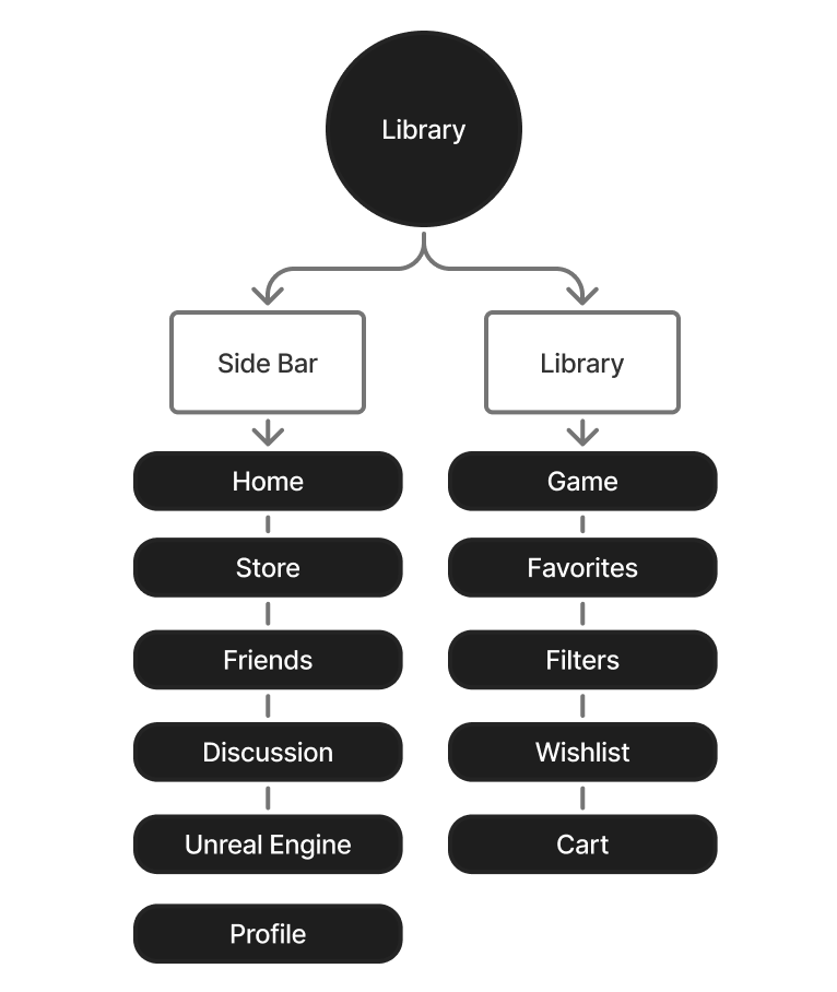
I had most of the foundational elements needed to create a cohesive and seamless design. However, several adjustments were made to improve user clarity and navigation.
A Community tab was added to the left sidebar to provide easier access to social and community features, increasing engagement beyond games.
Conversely, the Search Store option was removed from the library to reduce clutter and prevent confusion between searching for owned titles and browsing new ones. These refinements helpedthe overall experience and make the interface more intuitive.
Wireframe
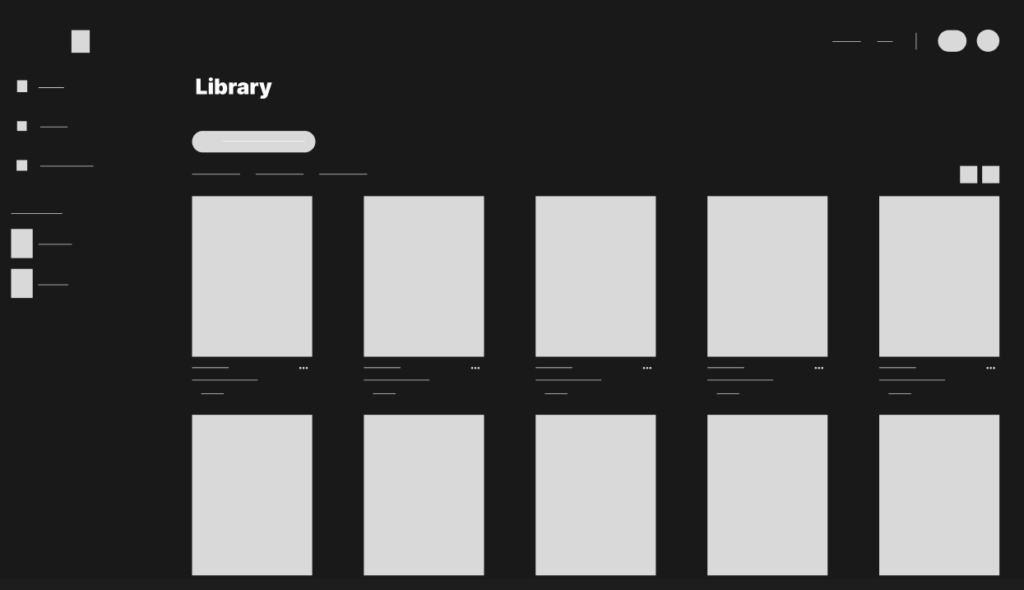
The initial wireframe presented a simplified version of the original Epic Games Library, focusing on reducing clutter and emphasizing clarity. Many secondary features were removed, and key interface elements were repositioned to create stronger visual impact.
For example, the library search button previously located on the right side was moved to the forefront of the page to make it more prominent and immediately accessible. These adjustments laid the foundation for a cleaner, more intuitive user experience.
Prototype – Design Flaws
The initial prototype, built directly from the wireframe, resulted in a library that felt overly simplistic and lacked visual depth. To address this, additional contextual information was introduced at the top of the page and organized within a separate container.
This adjustment created a clearer distinction between interactive elements and informational content, improving overall hierarchy and guiding the user’s attention more effectively.
Final Design