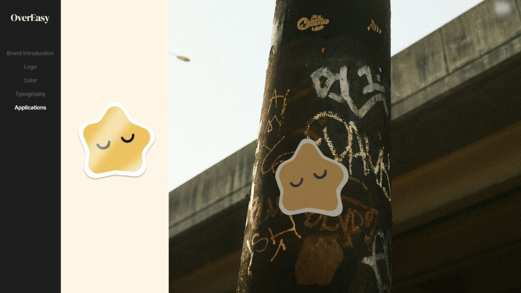
Role: UX/UI Designer | // Timeline: 2 Weeks // Team: Independent
// Brand Experience //
Project Overview
OverEasy is a mobile app concept that reimagines the cooking experience by helping users stay organized and reduce food waste. The goal was to design a tool that not only simplifies cooking but also promotes a decluttered and efficient home.
The app introduces a feature that encourages users to use ingredients that would typically go unused, helping them better understand and manage what they already have in their kitchens.
Problem Space
Cooking has become deeply embedded in modern culture, especially with the explosion of food content across social media platforms.
This shift has made traditional recipe apps feel stagnant and less adaptable to the needs of today’s users. With so much free and engaging content readily available online, conventional cooking apps often struggle to show any value.
OverEasy was designed to bridge that gap by creating a dynamic, personalized experience that goes beyond static recipes and helps users engage with their kitchens in more meaningful ways.
Title Branding
OverEasy was developed with the core concept of ease both in name and visual identity. The name draws inspiration from the term over easy, referencing a style of cooking eggs that naturally evokes simplicity, comfort, and familiarity. The name’s approachable tone reflects the brand’s goal of creating an effortless and inviting experience for its audience.

Logo Branding
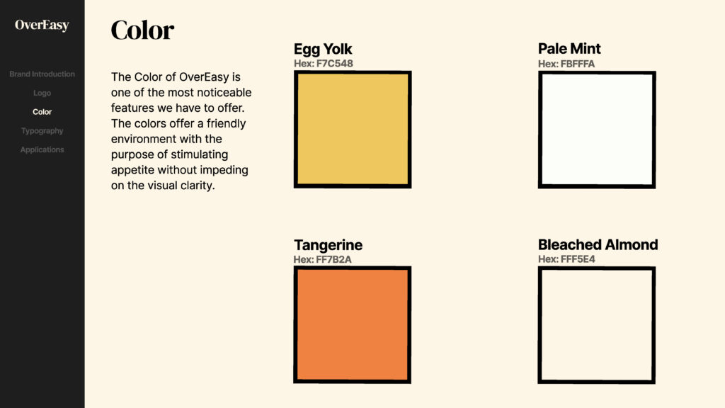
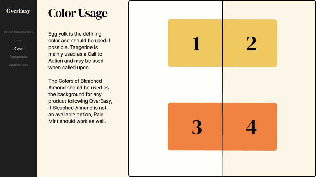
The logo was designed to embody the same sense of simplicity and warmth. Research on color psychology guided the selection of red, yellow, and green hues known to stimulate appetite and evoke positive associations with food. Yellow was ultimately chosen as the dominant color to reinforce both the egg reference and the brand’s optimistic, approachable character.
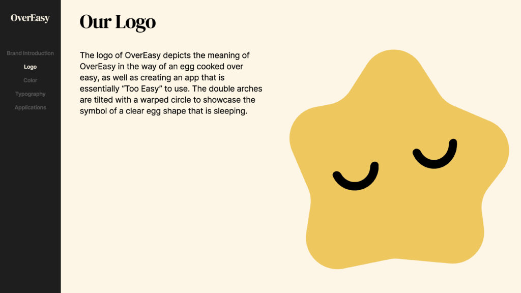
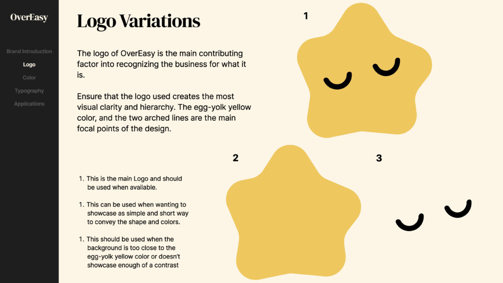
The minimalist egg-shaped logo uses as few lines as possible to maintain clarity and ease of recognition. Its form was subtly inspired by Gudetama, the Japanese character known for its relaxed and relatable personality, reinforcing the brand’s playful yet calming tone.
// Experience System //
Competitive Analysis
| Paprika | Big Oven | Yummly | |
| Pantry tracking | Has an integrated pantry list | Basic List | None |
| Recipe Suggestions on pantry | No Suggestions Given | “Use up leftovers” Style | None |
| Recipe Importation | Supported | Supported | Partial |
| User Interface | OK contrast and UI | Lacking, shown to be biggest complaint | Polished UI |
| Pricing | One time fee | free + premium features | free + premium features |
| User Experience | Although easy to use, many clicks to reach intended points | Easy to use and few clicks needed | Some clicks are used to reach a few intended points |
Qualitative Insights
Participants
- 8 Individuals
- Various Age Groups
- Various skills/knowledge in cooking
To better understand user behaviors and pain points, I conducted interviews with 8 participants across various age groups. Each participant was asked whether they had used a cooking or recipe app within the past year, and if not, why.
Most users reported that they no longer rely on dedicated cooking apps. Instead, they find recipes through search engines or social media platforms. The main reasons included lack of personalization, redundancy, and unnecessary complexity. These insights guided the direction of OverEasy toward simplicity, relevance, and integration into existing cooking habits.
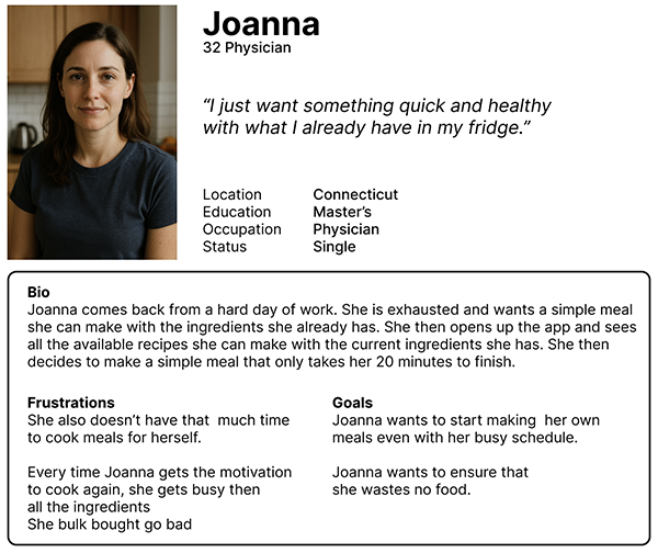
Persona #1
// User Interface //
Ideation
Many premockups were drawn up to integrate the necessary components without overwhelming the user with unnecessary clicks or tasks.
Since the app introduces new apps or tabs that are unique, it was important to convey that message without forcing the user to read a manual instruction simply to use my app.
User Flow & User Journey
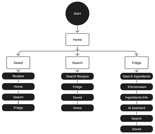
In order to create a seamless flow throughout the app, it was imperative to the users journey to identify the differences between the key tabs and the secondary tabs. Creating a clear hierarchy let me give spotlight to the features that made this cooking app different from competitors.
Wireframe
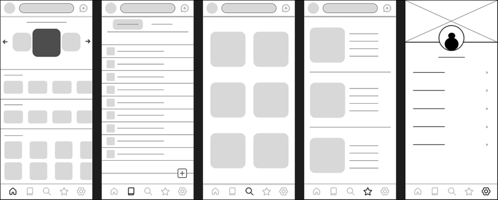
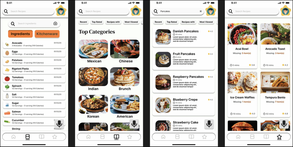
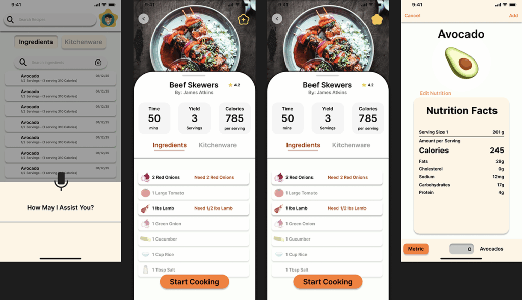
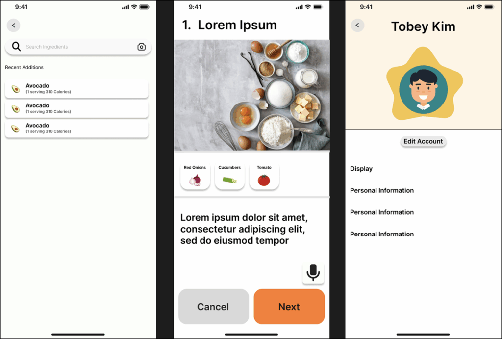
The initial wireframe established the foundation for the app’s core structure, outlining the five key screens: Home, Fridge, Search, Saved, and Settings. It provided a clear visual framework for how users would navigate the interface and interact with essential features. This stage was crucial in defining the hierarchy of information, ensuring intuitive flow, and setting the groundwork for consistent layout and user experience throughout the design.
Prototype – Problem
Early prototype testing exposed multiple areas for improvement in both functionality and visual design.
- Visual Design
poor color contrast, that used non-accesible Colors - Information Architecture
Grouping Inconsitencies. Inconistent visual hierchy - User flow
Inconsistent action buttons, too many steps to complete certain paths/tasks
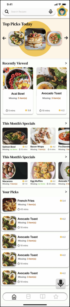
Prototype – Solutions
Several steps were taken to identify and resolve the issues, resulting in a more intuitive and cohesive user experience.
- Visual Design
The color palette was refined to improve readability and accessibility. Lighter background tones were introduced to enhance contrast with black text, creating a cleaner and more balanced interface. - User Flow
Navigation paths were simplified and optimized, allowing users to reach key tabs more quickly and efficiently. This streamlined the overall experience and reduced unnecessary steps in the journey. - Pain Points
Interactive elements were redesigned with clearer buttons and more intuitive actions, enabling users to complete common tasks faster and with less friction.
Final Design
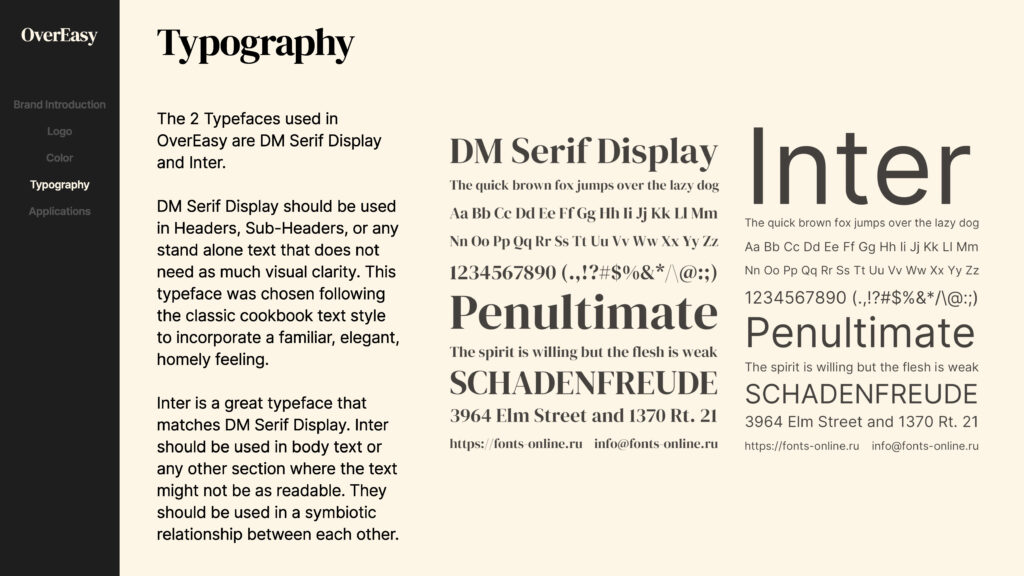
Brand Identity Visual System