Role: Graphic Designer | // Timeline: 4 Weeks // Team: Intent Collective
Delight is a home improvement company built around the core values of people and connection. Their mission is to help individuals improve, understand, and restore their homes and, by extension, their lives. This human-centered approach guided every decision in the brand identity.
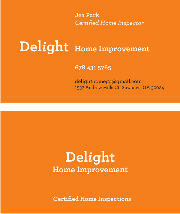
The color orange was chosen for its strong association with construction, energy, and home repair. To soften the tone and remove the sense of caution often linked to darker shades, a lighter hue was used. This created a warm and inviting look that communicates optimism and approachability.
The Archer typeface, a geometric slab serif, reinforces that same balance of structure and warmth. Its sturdy, architectural forms evoke a sense of foundation and reliability, while its friendly curves keep the brand approachable and human.
A subtle yet defining element of the logo is the italicized lowercase “i” in Delight. Emotive and playful in nature, it brings a touch of personality to the design. Positioned at the center of the wordmark, it symbolizes humans and reflects the company’s commitment to keeping people at the heart of everything it does.


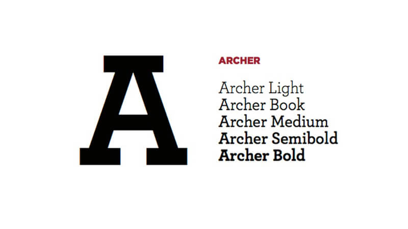
“Archer”styles: at heart, they’re text faces, and they feature all of the qualities needed to thrive at small sizes. (Antiques customarily have the traditional ‘two-storey’ forms of a and g, and a capital R that ends in a flourish.) Our Ziggurat typeface is an example of the Antique style in full flower, capturing the best of what the style has to offer: it’s warm, comforting, and persuasive. But this coziness comes at the expense of modernity, and in the wrong context even the best Antique can feel old-fashioned, musty, and irrelevant.
The Geometric is a twentieth-century riposte to the Antique. Informed by the same kind of rationalist thinking that inspired the great sans serifs of the Bauhaus, Geometrics abandon traditional forms in favor of mathematical strategies. A Geometric’s O is circular rather than elliptical, and its forms shed their residual contrast between thicks and thins. Geometrics usually apply this same rationalism to the woollier parts of the alphabet, replacing the alphabet’s beaks and tails and ball terminals with a program of matching serifs. While these faces can sometimes be bracingly modern, they’re often monotonous, and many Geometrics suffer from an astringent sting that makes them difficult to use and unwelcome to read.
When Martha Stewart Living asked us to develop a new typeface for the magazine, it seemed that a slab serif could answer much of the brief. A slab could be personable, straightforward, and credible, though it would take special effort to also make it pretty, hard-working, and frank. Archer would have to answer some formidable typographic demands, since Living is an almanac of lists, recipes, charts, diagrams, tables, calendars, and glossaries. To make the typeface frank — direct, but not brusque — we introduced subtle cues from the world of typewriter faces, which combine the ordinariness of Antiques with the modern practicality of Geometrics. We restored the vanished ‘ball terminals’ to the lowercase, and uncharacteristically applied these gestures to the capitals as well, in order to yield a font that’s friendly without being silly, and attractive without being flashy. The result is a typeface that’s well-mannered, easy to work with, and inviting to read.
The Archer typeface was designed by Jonathan Hoefler and Tobias Frere-Jones in 2001, with contributions from Jesse Ragan and additional material by Jordan Bell and Andy Clymer. While rooted in the ‘geometric slab serif’ style that emerged in the early nineteenth century (and reached full flower a century later), Archer’s many liberties with the style include its uncharacteristic application of ‘ball terminals’ to capital letters such as ‘C’ and ‘S,’ a detail traditionally found only in the lowercase alphabet. Archer was created for Martha Stewart Living, in whose pages the typeface first appeared in 2001.”