Role: Graphic Designer | // Timeline: 4 Weeks // Team: Intent Collective
“Design is the manifestation of intent. Intent™ is a design collective founded on the belief that every detail, every mark, gesture, and experience must be deliberate. Fueled by curiosity and ambition, we move fast, think boldly, and challenge conventions to create work that matters. Led by a seasoned design leader with global experience across industries and award-winning creative partnerships, Intent bridges the rigor of strategy with the poetry of visual storytelling. We specialize in shaping Brand Experience and People Experience through thoughtful process, strategic clarity, and message-driven design. From identity systems to immersive environments and limitless media, we craft signifiers that not only look striking but communicate with purpose. Alongside our client partnerships, we pursue self-initiated projects driven purely by the desire to explore, experiment, and expand what design can be. At Intent™, design is never an accident. It is an act of intent. Everything is design. We design everything. Design is everything.”
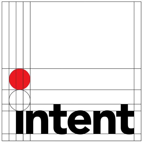
The logo for Intent Design was created to represent a company leading a forward-thinking design team. The goal was to craft a mark that felt simple, modern, and strong. The Gotham typeface, a geometric sans serif, was chosen for its clean lines and contemporary character, perfectly aligning with the company’s focus on clarity and purpose, its “intent.”
The tittle of the “i” in Intent was enlarged and shaded red, symbolizing the sun, a target, and a point of focus which is a visual metaphor for direction and presence, as in “I am here.” This small yet distinctive detail ensures that the logo remains recognizable and grounded, even from a distance or in low-visibility settings.
An alternate color scheme was developed for use on dark backgrounds. In this version, the wordmark appears in white, enclosed within a red square, maintaining the same sense of precision and presence while ensuring visual consistency across applications.


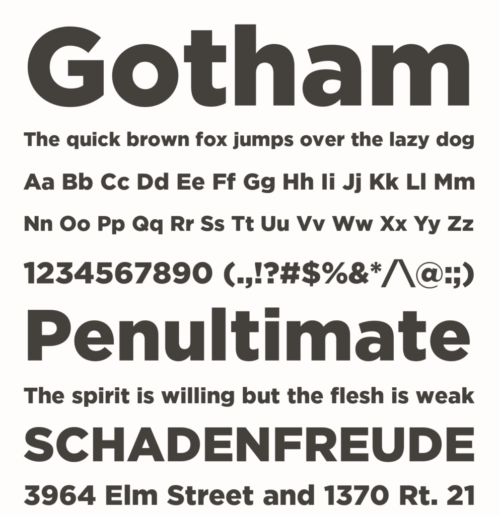
“Every designer has admired the no-nonsense lettering of the American vernacular, those letters of paint, plaster, neon, glass and steel that figure so prominently in the urban landscape. From these humble beginnings came Gotham, a hard-working typeface for the ages.
The Gotham typeface was designed by Tobias Frere-Jones in 2000, with contributions from Jonathan Hoefler and Jesse Ragan. Additional material by Sara Soskolne, Andy Clymer, Kevin Dresser, Wendy Ellerton, Malou Verlomme, Ksenya Samarskaya, Aoife Mooney, Erin McLaughlin, and Colin M. Ford.
A sans serif that shares many attributes of typography’s ‘geometric’ genus, Gotham was inspired by a style of bold capital letters that evolved outside the typographic tradition in the early twentieth century, common to lithographed posters, enamel signs, and commercial facades throughout New York City. First appearing in the pages of GQ magazine in 2001, Gotham gained international attention in 2007 when it was adopted by the presidential campaign of Barack Obama. One of the most popular and influential typefaces of our time, Gotham is in the permanent collection of the Museum of Modern Art in New York.”