Role: Graphic Designer // Timeline: 2 Weeks // Team: Solo
This is a self-initiated concept project created for portfolio purposes. It is not affiliated with or endorsed by the Deadlock team or Valve . The redesign reflects personal exploration.
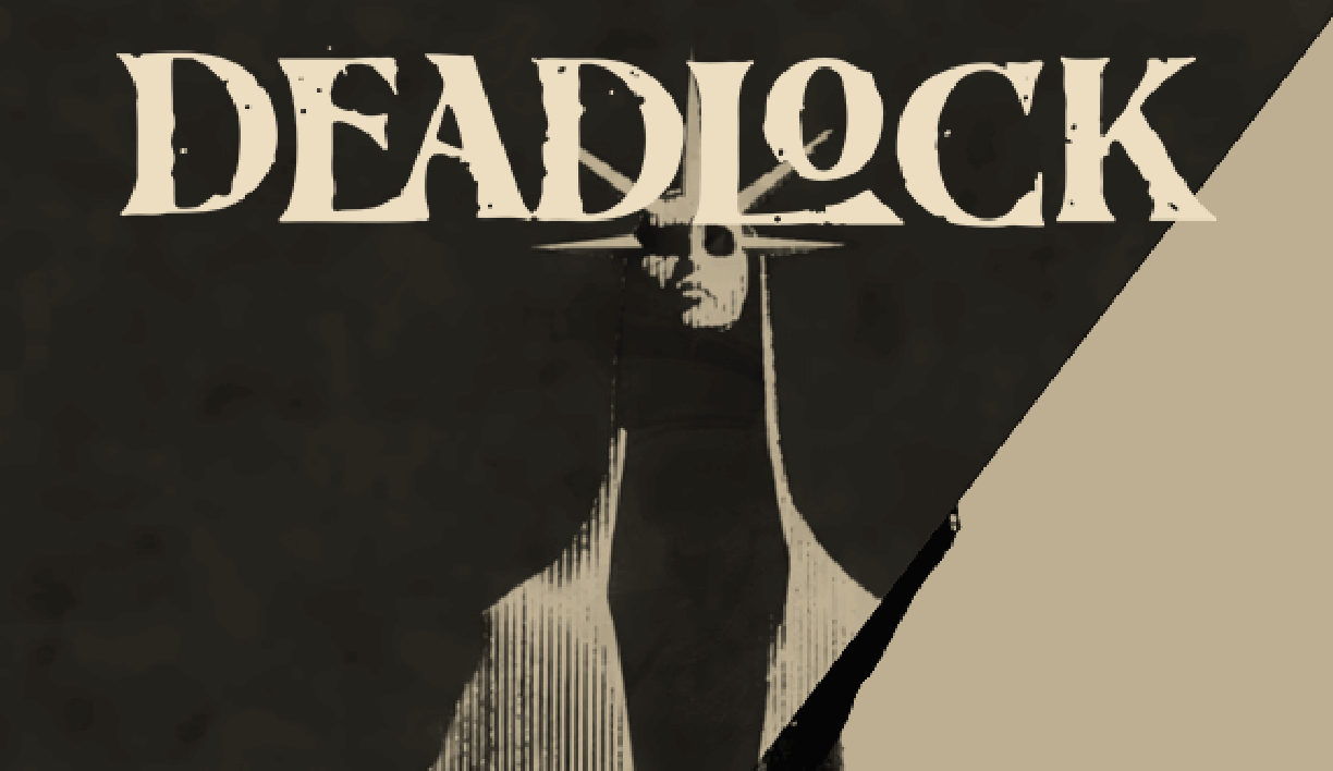
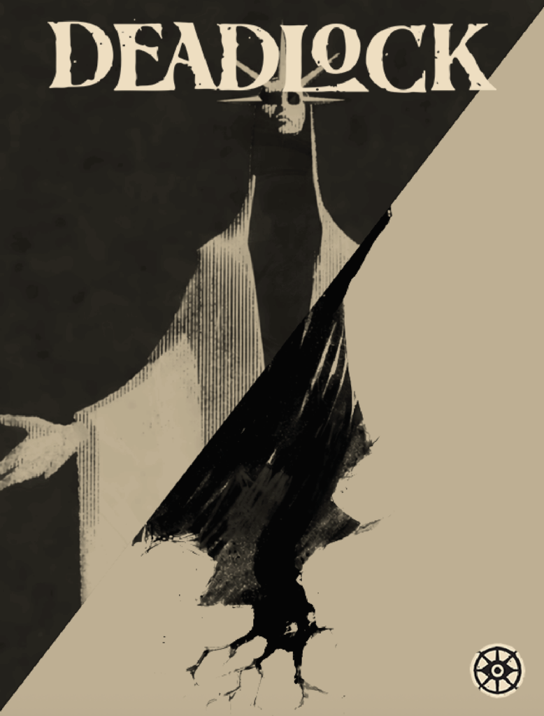
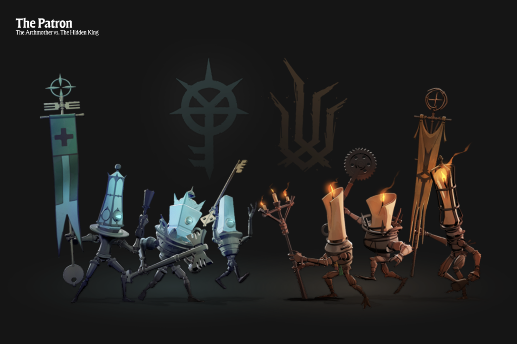
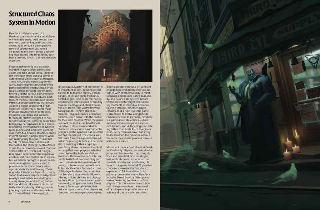
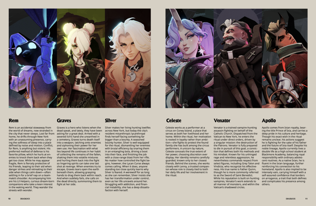
This project explores the visual system of the video game Deadlock through the format of an editorial magazine. The goal was to translate the game’s established identity into print, creating a project that feels aligned to its world rather than separate from it.
Editorial Design / Typography / Visual Systems
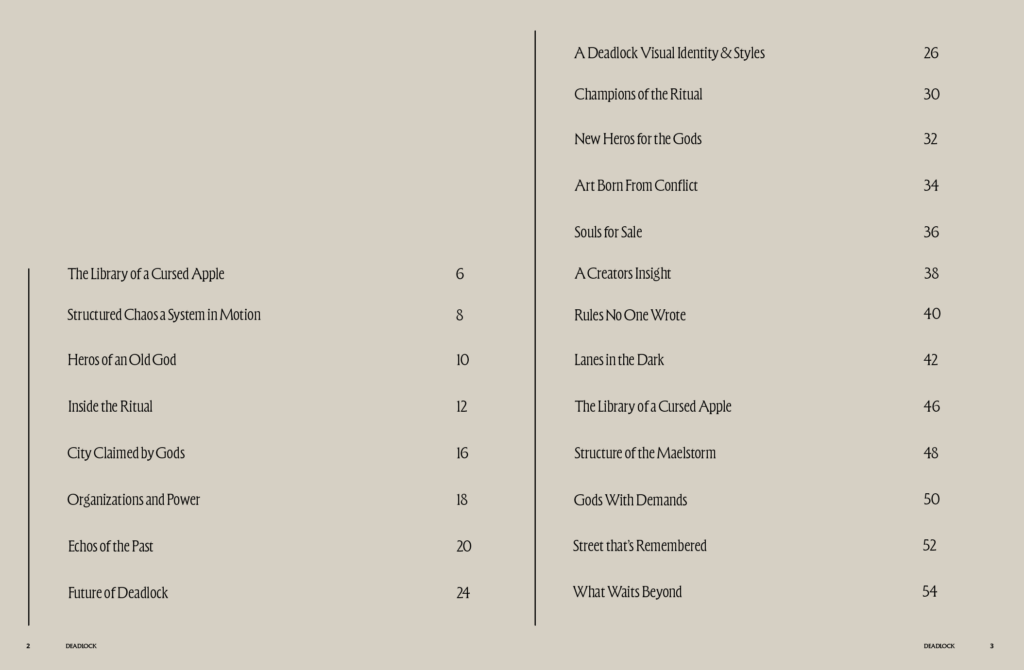
The publication opens with a restrained table of contents, reinforcing hierarchy and typographic structure.
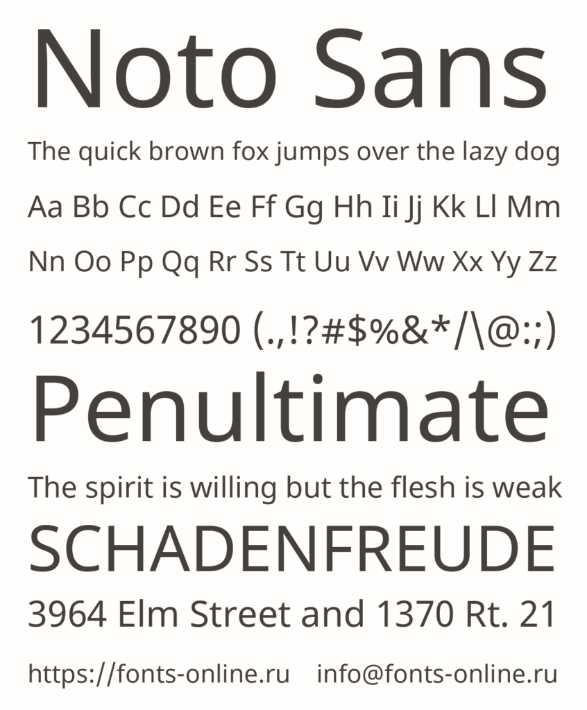
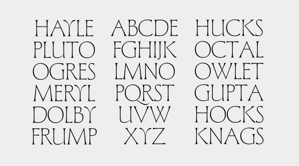
To align closely with the game’s graphical identity, the same typefaces were used in their respective roles. Forevs appears in headlines and standalone moments, prioritizing tone and stylization over pure readability. Noto Sans is used for body copy to ensure clarity and sustained legibility across longer passages.
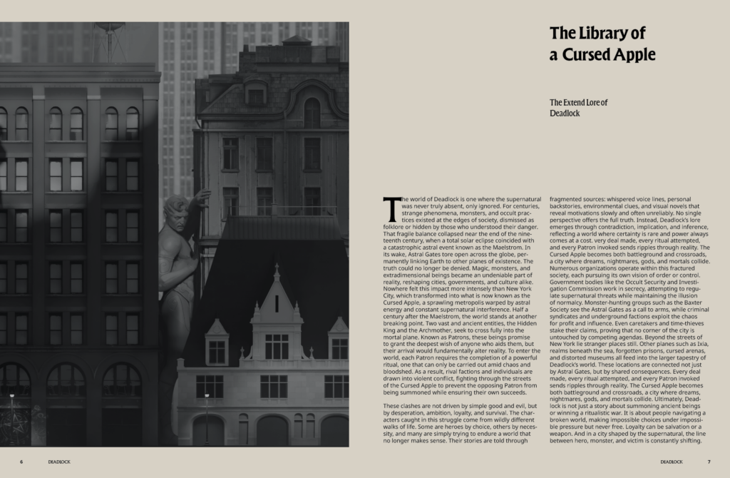
Full Spread Introduction
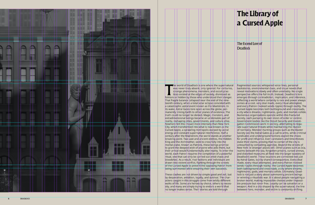
A 12-column grid system structures the entire publication. This allowed flexibility across spreads working in two, three, or four-column groupings while maintaining balance and consistency. The grid creates rhythm without sacrificing freedom.
This project brings together my background in psychology, typography, and layout design to create a publication that reflects the intensity and controlled chaos of the original source.
Role: Graphic Designer // Timeline: 2 Weeks // Team: Solo
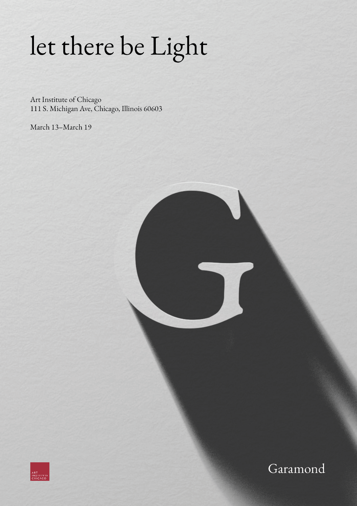
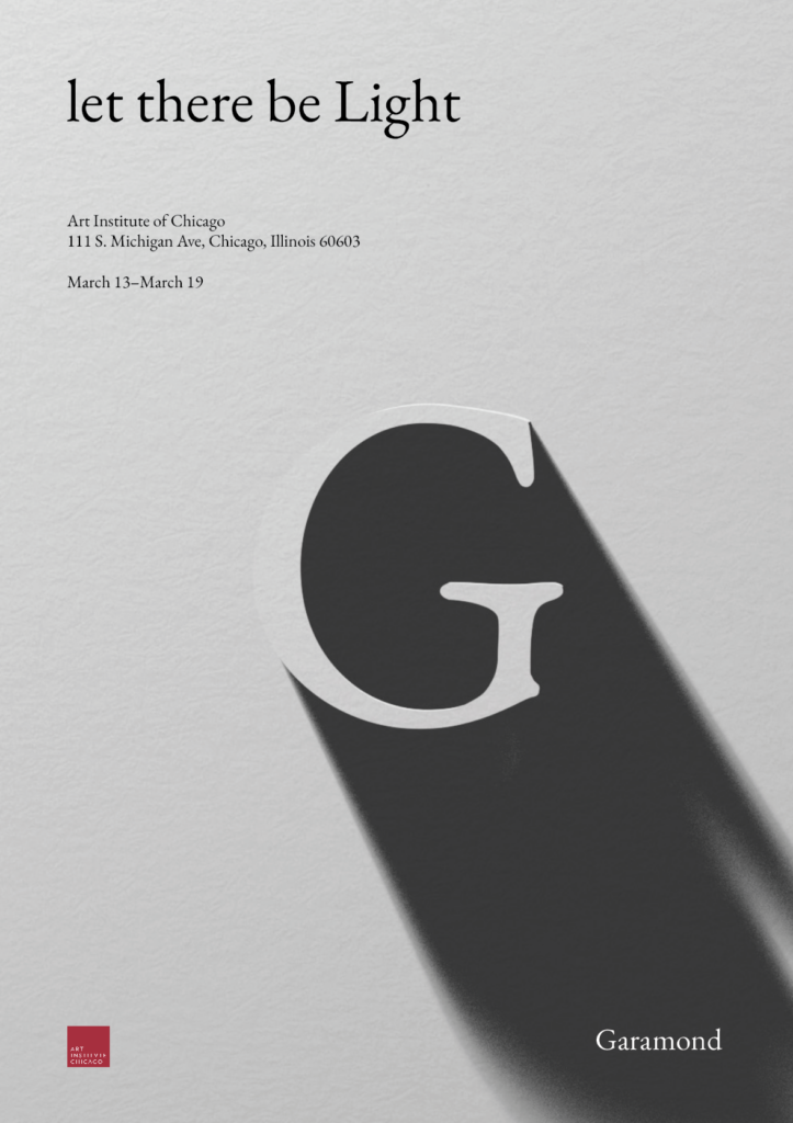
This poster explores one of Garamond’s most enduring qualities: its resilience and continued relevance in design. At the heart of the poster is light. A concept older than most things in the universe and, in the Bible, the third creation. To reflect this, I created a 3D “G” in Garamond using Blender and positioned a light source to create a striking contrast between light and shadow. In the phrase “let there be Light”, only “Light” is capitalized and centered, drawing focus to its significance.
The word “Garamond” appears in white within the shadow, subtly drawing attention without competing with the main message. The exhibit’s address and location are placed in the top-left corner, aligning with the source of light and guiding the viewer’s eye along the diagonal path of the shadow. A minimal color palette reinforces the contrast between light and darkness, while a subtle paper texture references the Bible and Robert Estienne, who helped popularize Claude Garamond’s typeface.
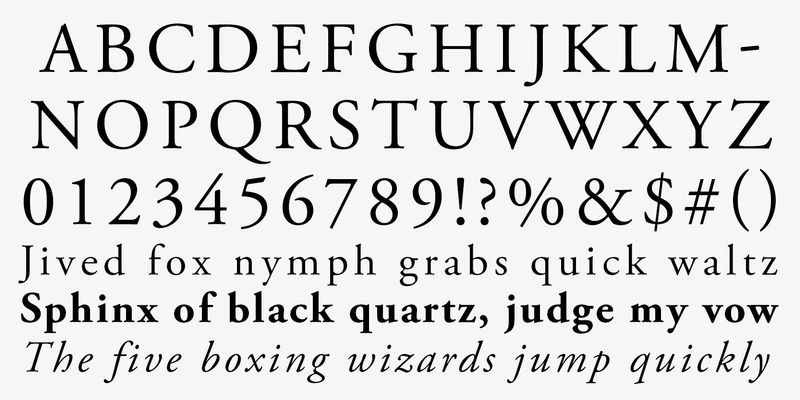
A Typeface that established elegance and readability from the Renaissance that continues to impact and inspire typography centuries past, that is Garamond. Garamond is a classic group of old serif typefaces considered this due to its organic structure yet upright and structured design. Garamond is also considered one of the first Old Style Designs finding its originality due to being a contemporary typeface compared to the standard Blackletter typeface. Some of Garamond’s most notable features are its smaller than average and early closed off apertures, Low Line contrast, pronounced diagonal stress, higher X-height, and serifs that are heavily bracketed and rounded on the edges.
The Garamond typeface is named after 16th-century French engraver Claude Garamond. He came to prominence around 1540 when his greek typefaces were requested by famous 16th-century French printer Robert Estienne. Claude Garamond based the Greek typefaces on the handwriting of fontainebleau’s, Angelo Vergecio. The Garamond typeface became quickly popular due to its economical ink usage and readability on those with large bodies and small text influencing European punch cutters for the next 150 years to come. Claude Garamond was one of the first to break away from the notion that type should be an adaptation of the handwritten script and this ideology may have come due to his apprenticeship with Renaissance printer Antonie Augerau who produced Roman type compared to the standard Blackletter, and later French humanist and engraver Geoffroy Troy who was best known for adding accents on letters in French. These new ideologies of typefaces perhaps came due to the flourishing Renaissance era, as well as Paris becoming Europe’s biggest printing center creating the need for a cleaner and more legible style. Over the years many different variations of Garamond have been developed from Morris Fuller & Thomas Maitling’s “The Third Version of Garamond” in 1919, all the way to 1989 from Adobe Systems Incorporated’s “Adobe Garamond Pro”. Although the Garamond typeface was inspired by Claude’s Garamond specific style the actual Garamond typeface was printed and pressed by French Protestant Printer, Jean Jannon.
Even centuries later, Garamond can still be seen all around due to its professionalism, elegance, and readability. Many books like The Hunger Games, Harry Potter, and many Dr.Seuss series use Garamond due to its excellent readability in books. Prestigious Swiss watch manufacturer, Rolex have also used the Garamond typeface due to them considering Garamond one of the most elegant typefaces that matched the branding and audience they looked for. Although the unique old-serif type style gave Garamond its notability, these are also the reason for its underside on computer screens and mobile devices due to it being hard to read in smaller sizes and lighter weights on a screen. Through this, Garamond continues to endure, its beauty and elegance transcends time, and continues to remain a powerful testament to design.
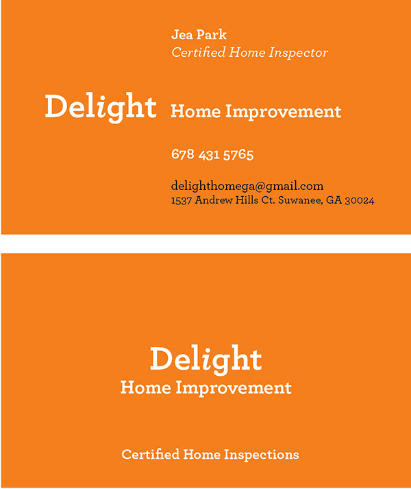
Delight is a home improvement company built around the core values of people and connection. Their mission is to help individuals improve, understand, and restore their homes and, by extension, their lives. This human-centered approach guided every decision in the brand identity.
The color orange was chosen for its strong association with construction, energy, and home repair. To soften the tone and remove the sense of caution often linked to darker shades, a lighter hue was used. This created a warm and inviting look that communicates optimism and approachability.
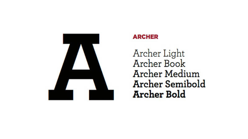
The Archer typeface, a geometric slab serif, reinforces that same balance of structure and warmth. Its sturdy, architectural forms evoke a sense of foundation and reliability, while its friendly curves keep the brand approachable and human.
A subtle yet defining element of the logo is the italicized lowercase “i” in Delight. Emotive and playful in nature, it brings a touch of personality to the design. Positioned at the center of the wordmark, it symbolizes humans and reflects the company’s commitment to keeping people at the heart of everything it does.
“Archer”styles: at heart, they’re text faces, and they feature all of the qualities needed to thrive at small sizes. (Antiques customarily have the traditional ‘two-storey’ forms of a and g, and a capital R that ends in a flourish.) Our Ziggurat typeface is an example of the Antique style in full flower, capturing the best of what the style has to offer: it’s warm, comforting, and persuasive. But this coziness comes at the expense of modernity, and in the wrong context even the best Antique can feel old-fashioned, musty, and irrelevant.
The Geometric is a twentieth-century riposte to the Antique. Informed by the same kind of rationalist thinking that inspired the great sans serifs of the Bauhaus, Geometrics abandon traditional forms in favor of mathematical strategies. A Geometric’s O is circular rather than elliptical, and its forms shed their residual contrast between thicks and thins. Geometrics usually apply this same rationalism to the woollier parts of the alphabet, replacing the alphabet’s beaks and tails and ball terminals with a program of matching serifs. While these faces can sometimes be bracingly modern, they’re often monotonous, and many Geometrics suffer from an astringent sting that makes them difficult to use and unwelcome to read.
When Martha Stewart Living asked us to develop a new typeface for the magazine, it seemed that a slab serif could answer much of the brief. A slab could be personable, straightforward, and credible, though it would take special effort to also make it pretty, hard-working, and frank. Archer would have to answer some formidable typographic demands, since Living is an almanac of lists, recipes, charts, diagrams, tables, calendars, and glossaries. To make the typeface frank — direct, but not brusque — we introduced subtle cues from the world of typewriter faces, which combine the ordinariness of Antiques with the modern practicality of Geometrics. We restored the vanished ‘ball terminals’ to the lowercase, and uncharacteristically applied these gestures to the capitals as well, in order to yield a font that’s friendly without being silly, and attractive without being flashy. The result is a typeface that’s well-mannered, easy to work with, and inviting to read.
The Archer typeface was designed by Jonathan Hoefler and Tobias Frere-Jones in 2001, with contributions from Jesse Ragan and additional material by Jordan Bell and Andy Clymer. While rooted in the ‘geometric slab serif’ style that emerged in the early nineteenth century (and reached full flower a century later), Archer’s many liberties with the style include its uncharacteristic application of ‘ball terminals’ to capital letters such as ‘C’ and ‘S,’ a detail traditionally found only in the lowercase alphabet. Archer was created for Martha Stewart Living, in whose pages the typeface first appeared in 2001.”
“Design is the manifestation of intent. Intent™ is a design collective founded on the belief that every detail, every mark, gesture, and experience must be deliberate. Fueled by curiosity and ambition, we move fast, think boldly, and challenge conventions to create work that matters. Led by a seasoned design leader with global experience across industries and award-winning creative partnerships, Intent bridges the rigor of strategy with the poetry of visual storytelling. We specialize in shaping Brand Experience and People Experience through thoughtful process, strategic clarity, and message-driven design. From identity systems to immersive environments and limitless media, we craft signifiers that not only look striking but communicate with purpose. Alongside our client partnerships, we pursue self-initiated projects driven purely by the desire to explore, experiment, and expand what design can be. At Intent™, design is never an accident. It is an act of intent. Everything is design. We design everything. Design is everything.”
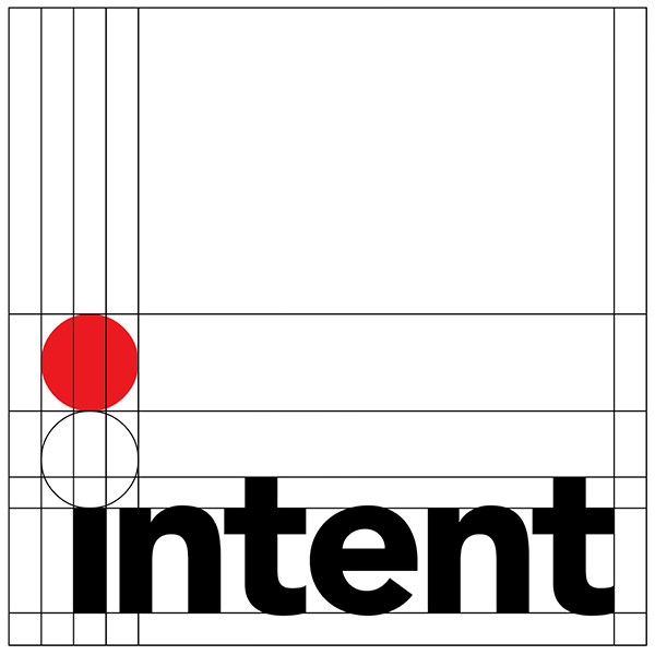
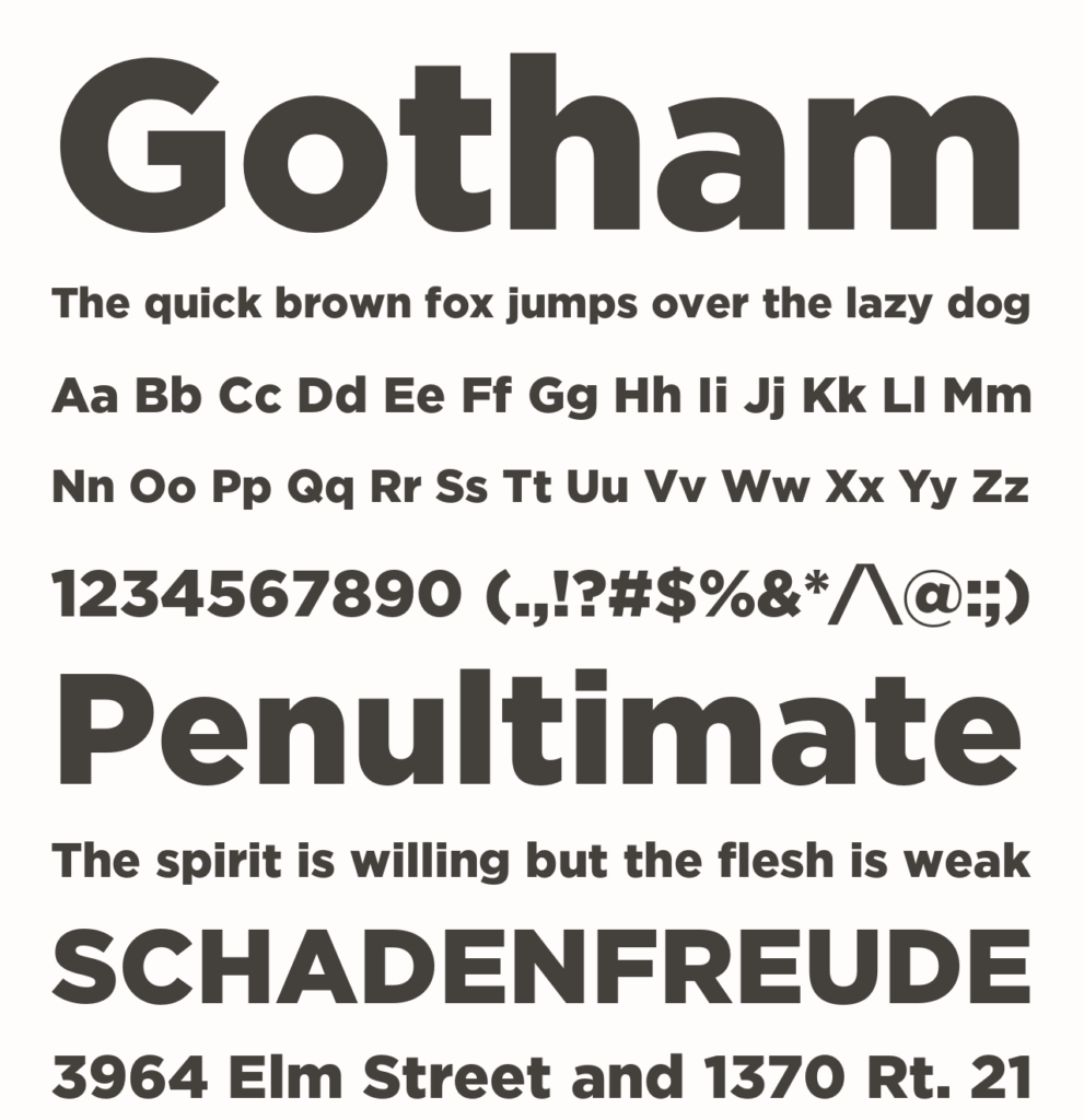
The logo for Intent Design was created to represent a company leading a forward-thinking design team. The goal was to craft a mark that felt simple, modern, and strong. The Gotham typeface, a geometric sans serif, was chosen for its clean lines and contemporary character, perfectly aligning with the company’s focus on clarity and purpose, its “intent.”
The tittle of the “i” in Intent was enlarged and shaded red, symbolizing the sun, a target, and a point of focus which is a visual metaphor for direction and presence, as in “I am here.” This small yet distinctive detail ensures that the logo remains recognizable and grounded, even from a distance or in low-visibility settings.
An alternate color scheme was developed for use on dark backgrounds. In this version, the wordmark appears in white, enclosed within a red square, maintaining the same sense of precision and presence while ensuring visual consistency across applications.
“Every designer has admired the no-nonsense lettering of the American vernacular, those letters of paint, plaster, neon, glass and steel that figure so prominently in the urban landscape. From these humble beginnings came Gotham, a hard-working typeface for the ages.
The Gotham typeface was designed by Tobias Frere-Jones in 2000, with contributions from Jonathan Hoefler and Jesse Ragan. Additional material by Sara Soskolne, Andy Clymer, Kevin Dresser, Wendy Ellerton, Malou Verlomme, Ksenya Samarskaya, Aoife Mooney, Erin McLaughlin, and Colin M. Ford.
A sans serif that shares many attributes of typography’s ‘geometric’ genus, Gotham was inspired by a style of bold capital letters that evolved outside the typographic tradition in the early twentieth century, common to lithographed posters, enamel signs, and commercial facades throughout New York City. First appearing in the pages of GQ magazine in 2001, Gotham gained international attention in 2007 when it was adopted by the presidential campaign of Barack Obama. One of the most popular and influential typefaces of our time, Gotham is in the permanent collection of the Museum of Modern Art in New York.”
This is a self-initiated concept project created for portfolio purposes. It is not affiliated with or endorsed by Google. The redesign reflects personal exploration.
// Brand Experience //
Project Overview
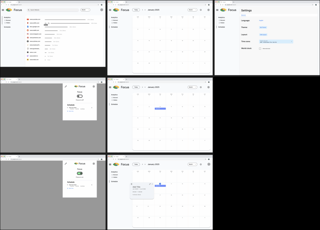
Google Focus is a digital extension designed to help users take control of their time online. It enables users to block distracting websites, schedule focus periods, and set boundaries around their digital habits.
By integrating seamlessly into the browser, it encourages more mindful browsing and reduces the constant pull of online distractions.
Problem Space
As one of the most widely used platforms in the world, Google plays an integral role in how people learn, work, and access information. Yet, despite its influence, Google provides limited support for users seeking to manage distractions and maintain focus.
This project explores how a unified, distraction-reducing experience could help users create a more productive and mindful environment while studying or working within the Google ecosystem.
Title Branding
Google maintains a consistent and minimalist approach to naming its products, often combining the word “Google” with a single descriptor that clearly defines the product’s purpose such as Google Docs or Google Maps.
Following this convention, Google Focus was named to directly communicate its primary function of helping users maintain concentration and reduce digital distractions. The name reflects Google’s straightforward branding philosophy, emphasizing clarity and intent.
Logo Branding
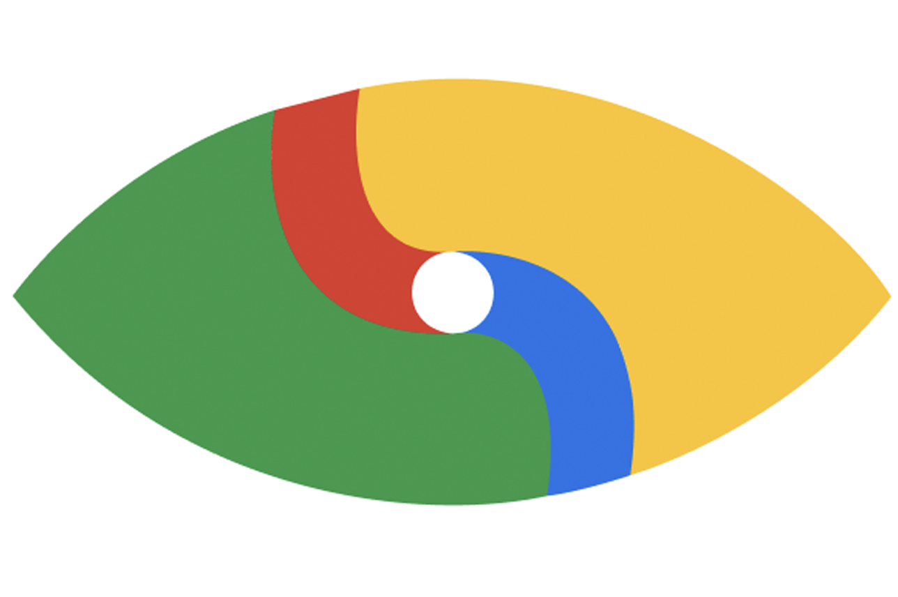
Google’s visual branding is characterized by simple sturctures and the use of its iconic four color palette. Each product logo is distinct yet instantly recognizable as part of the broader Google ecosystem. In keeping with this design language, the logo for Google Focus incorporates the same color sequence and minimalist style. The logo’s central shape resembles an eye, symbolizing awareness and attention, reinforcing the product’s core purpose of helping users stay focused and mindful during screen time.
// Experience System //
Qualitative Insights
Apple Focus is a major competitor in the distraction management space. According to Business of Apps, 56 percent of iPhone users have used its Focus mode to control notifications and manage app access. According to Medium, some reports suggest that average focus sessions increased from 18 minutes to 48 minutes after adopting the feature. However, despite this level of adoption, there remains a significant segment of users who have never used Focus, potentially due to setup friction, lack of awareness, or the perception that it is unnecessary.
Target Audience
Google Focus is designed for users who want to manage their digital habits without leaving the Google ecosystem. This includes students, professionals, and remote workers who spend much of their day online and want to limit distractions.
The app aims to simplify focus management through intuitive scheduling integration rather than relying on third party apps/extensions.
// User Interface //
Ideation
A Google extension introduces unique design challenges compared to a standard app or website. The limited space within the extension popup requires careful prioritization of content and functionality.
Only the most essential information and actions should be visible, while secondary elements are minimized or removed entirely. To address this, a settings button was added to allow users to adjust their preferences when needed, while the primary focus of the popup remains thetoggle to turn Google Focus on or off quickly.
User Flow & User Journey
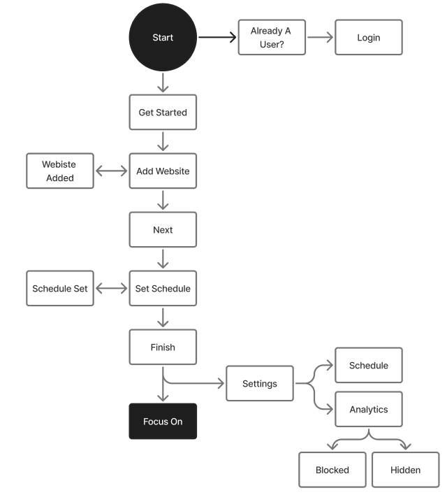
The initial user journey is intentionally longer to provide a thorough setup process that helps users customize their experience from the start. Once configured, the settings allow users to easily adjust which websites they want to block and specify the times those restrictions should apply, giving them full control over their focus routine.
Wireframe
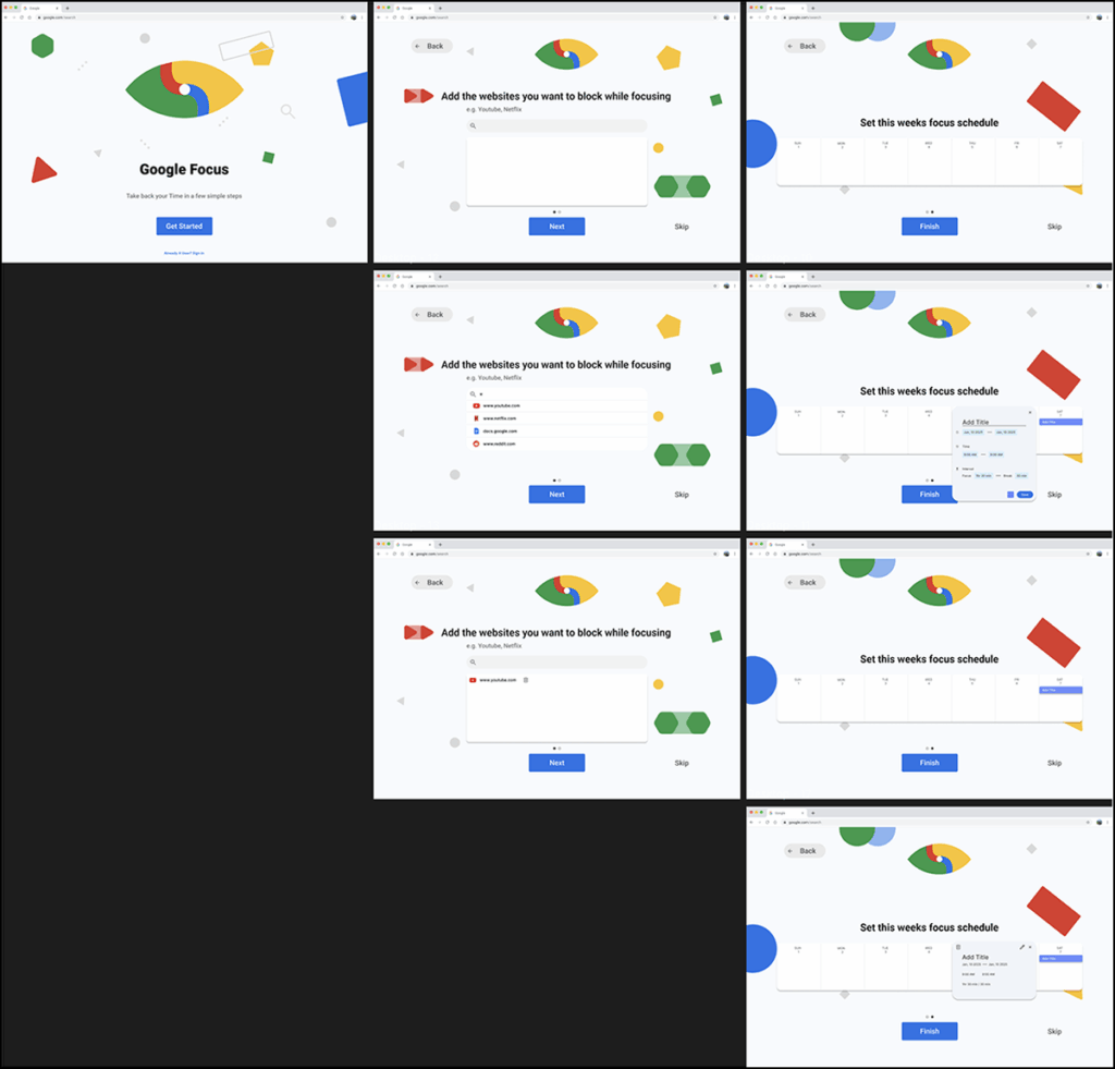
The wireframe follows Google’s familiar “Get Started” flow, prompting users to input the websites they wish to block and set their preferred focus schedule. After the initial setup, the wireframe showcases the Google Focus extension interface, including the main popup design, settings menu, and a basic analytics view that provides insight into focus patterns and screen time reduction.
Prototype – Design Flaws
The initial extension design contained too much visual clutter, which distracted from the primary focus toggle and weakened the overall hierarchy. In addition, important customization options such as language preferences and general settings were not clearly visible.
To address this, a dedicated settings tab was introduced, providing users with an organized and accessible space to adjust their preferences without interfering with the main focus controls.
This is a self-initiated concept project created for portfolio purposes. It is not affiliated with or endorsed by Epic Games. The redesign reflects personal exploration and suggestions for improving user experience.
// Brand Experience //
Project Overview
Epic Games is an entertainment Industry with the specific pursuit in Video Games. They help developers develop, upload, and operate games helping distribute said games to a wide platform of Gamers.
They are also responsible for developing hit game “Fortnite” and have continued to cement themselves as a giant in the video game industry. However, as of current times, another video game company, Steam, with the same objective have been at the forefront of this section for many years.
Design Challenge
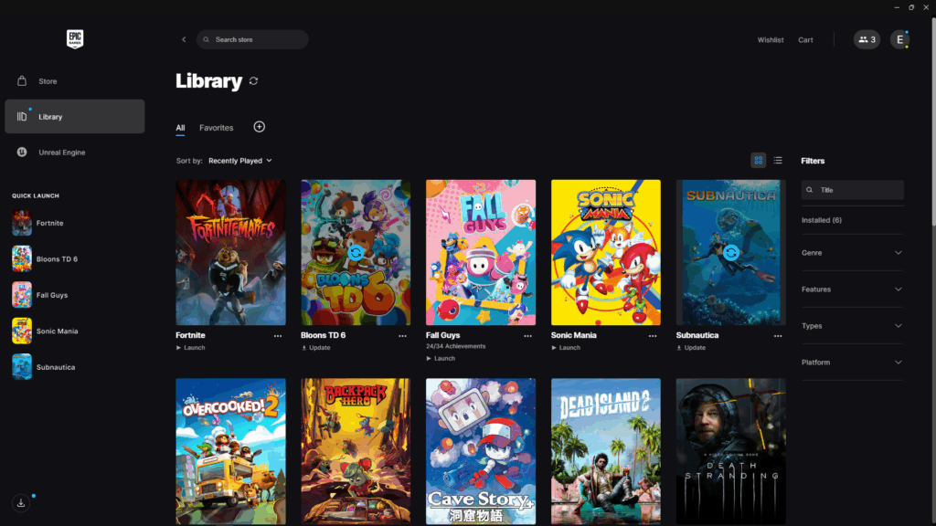
Despite Epic Games’ status as a major player in the gaming industry, the user experience of their desktop launcher suffers from design issues.
The platform struggles with poor visual hierarchy, making it difficult for users to quickly identify important actions or content. Additionally, key user journeys such as launching a game, browsing a library, or discovering new titles are lacking leading to users needing to click more times than needed.
This project focuses on redesigning the Epic Games Library to improve usability and reduce friction in everyday interactions. The goal is to create a cleaner, more intuitive layout that highlights the most important user actions and enhances the overall browsing and discovery experience.
Compromise
At first, the goal was to redesign every page within the Epic Games launcher. However, I soon realized that the objective was not just to make the interface look better, it was to make it more intuitive and user friendly.
From a UX perspective, the areas that required the most attention were the Library and the side navigation column, where usability issues most directly affected how players accessed and managed their games.
Material Design
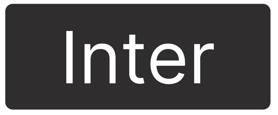
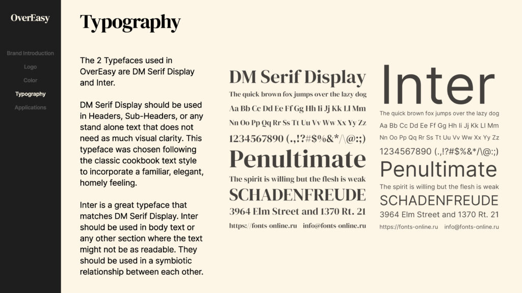
Epic Games primarily uses a sans serif typeface similar in appearance to the Inter family, chosen for its clarity and versatility across digital interfaces.
The platform’s color palette is built around a dark theme, featuring a near black tone with subtle gray and blue undertones to emphasize selected icons and interactive elements. This is contrasted by pure white text and highlights, maintaining strong visual balance and readability within the launcher’s default dark mode environment.
// Experience System //
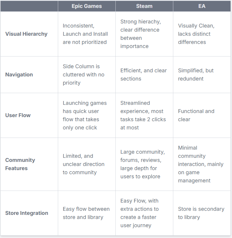
Competitive Analysis
Qualitative Insights
Participants
6 Individuals
ages 16-30
Casual to Avid Gamers
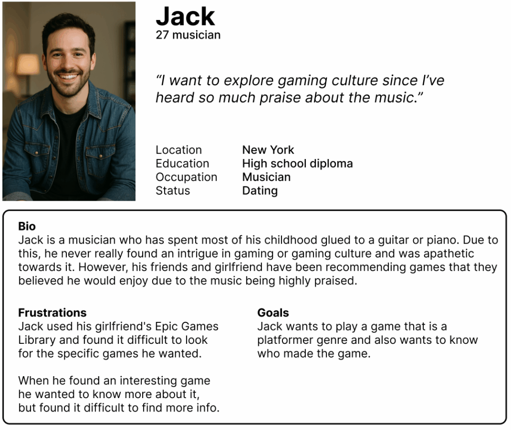
To better understand user behavior and preferences, I conducted interviews with six participants who actively play or engage with games across multiple platforms. Each participant was asked to compare their experiences using the game libraries of Epic Games, Steam, and EA App.
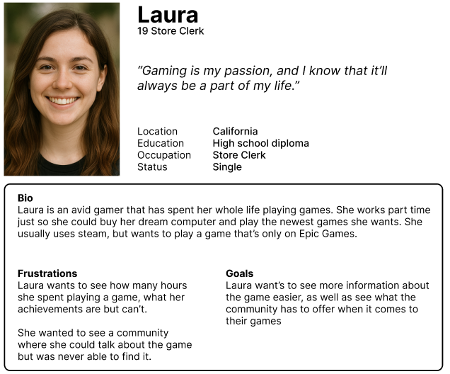
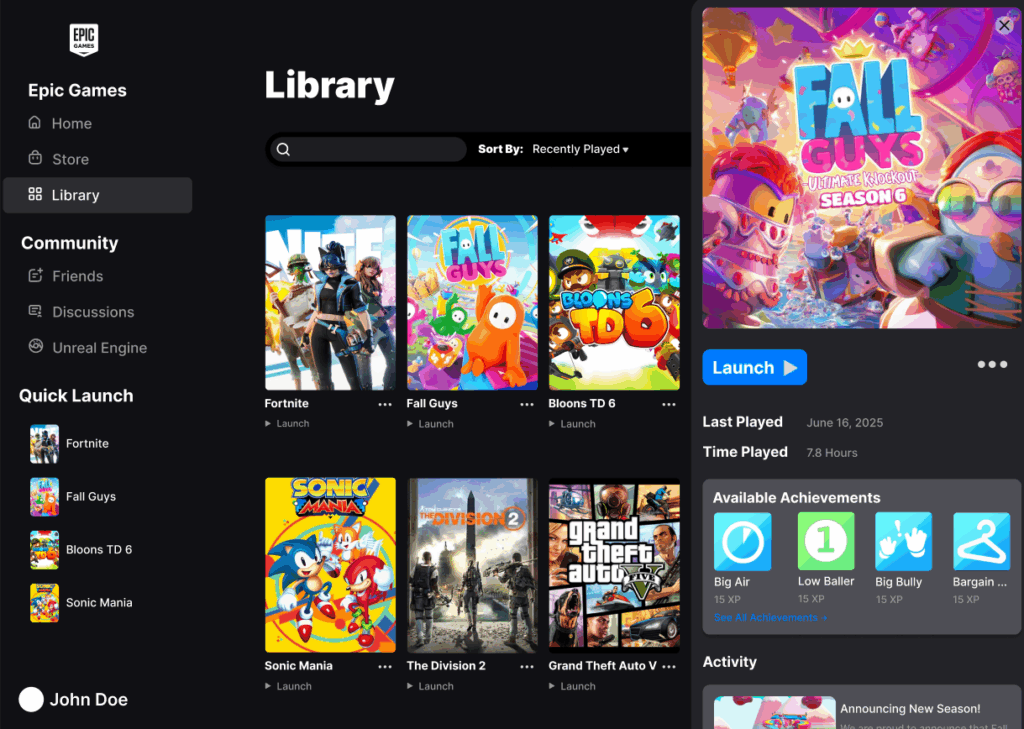
Most participants quickly noted that the Epic Games Library felt unintuitive and visually lacking especially when compared to competitors. They emphasized the lack of accessible information for each game, such as playtime, achievements, or update details, which made it harder to manage or browse their collections effectively. In contrast, Steam was consistently praised for its clear structure, detailed information hierarchy, and ease of navigation.
Participants appreciated how efficiently they could launch, organize, and explore new titles. EA App received neutral feedback, unctional but unremarkable. These insights revealed that Epic’s main pain points center around usability and information visibility, guiding this redesign toward a more player centered experience.
Persona #1
Persona #2
// User Interface //
Ideation
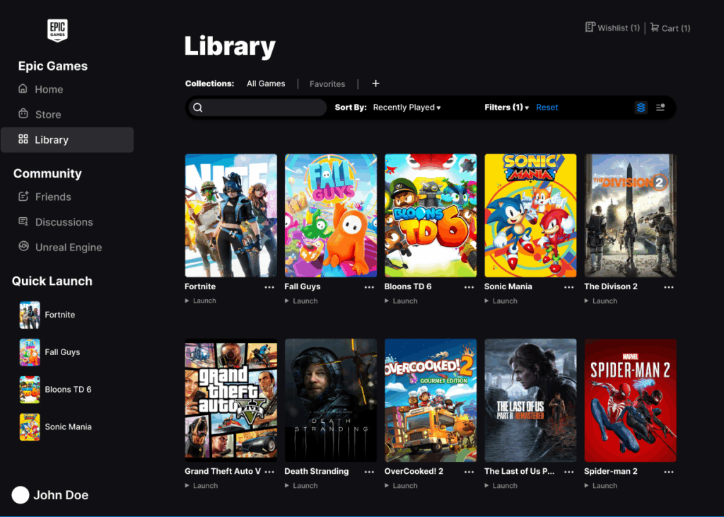
It was important to maintain consistency with the original material design language established by Epic Games. This meant preserving the brand’s core typography, color system, and iconography to ensure that the redesign felt authentic and aligned with the company’s established visual identity.
Rather than reinventing the interface, the goal was to refine and clarify it, simplifying navigation, improving hierarchy, and creating a more seamless interaction flow without disrupting the brand’s recognizable look and feel. By staying faithful to Epic’s existing design framework, the new layout could focus on enhancing usability and clarity while still feeling unmistakably Epic Games.
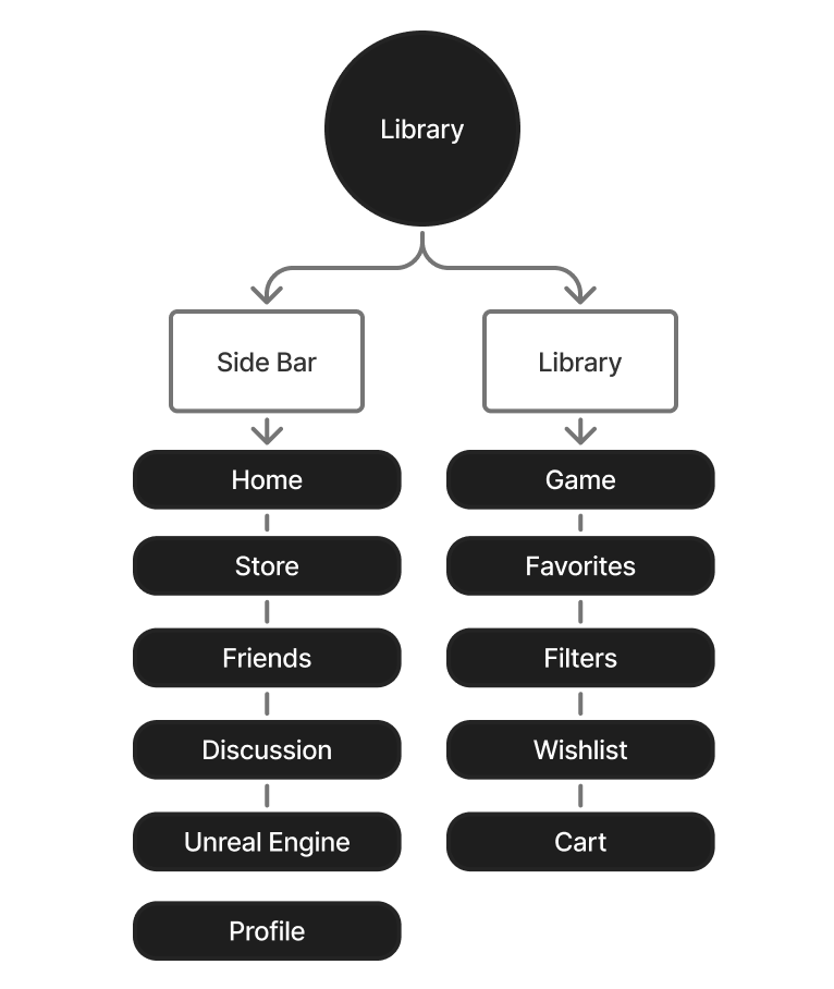
User Flow & User Journey
I had most of the foundational elements needed to create a cohesive and seamless design. However, several adjustments were made to improve user clarity and navigation.
A Community tab was added to the left sidebar to provide easier access to social and community features, increasing engagement beyond games.
Conversely, the Search Store option was removed from the library to reduce clutter and prevent confusion between searching for owned titles and browsing new ones. These refinements helpedthe overall experience and make the interface more intuitive.
Wireframe
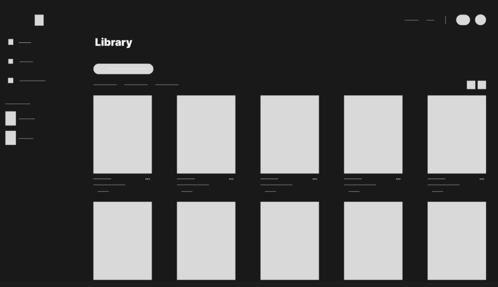
The initial wireframe presented a simplified version of the original Epic Games Library, focusing on reducing clutter and emphasizing clarity. Many secondary features were removed, and key interface elements were repositioned to create stronger visual impact.
For example, the library search button previously located on the right side was moved to the forefront of the page to make it more prominent and immediately accessible. These adjustments laid the foundation for a cleaner, more intuitive user experience.
Prototype – Design Flaws
The initial prototype, built directly from the wireframe, resulted in a library that felt overly simplistic and lacked visual depth. To address this, additional contextual information was introduced at the top of the page and organized within a separate container.
This adjustment created a clearer distinction between interactive elements and informational content, improving overall hierarchy and guiding the user’s attention more effectively.
This project involved designing a concept website for a Fortune 500 company to present our vision for a next generation online marketplace built directly within Discord. The objective was to communicate a modern and forward thinking brand identity while preserving the company’s established material design language. The result is a refined and interactive web experience that connects community engagement with ecommerce functionality.
Branding
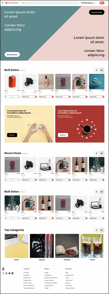
The project was modeled after DoorDash’s visual system and branding standards. Because this was a client directed contract, initial qualitative and quantitative research was not required.
The primary objective was to design a clean and modern website that adhered strictly to DoorDash’s established material design guidelines. This included using the company’s proprietary color palette and custom iconography.
// User Interface //
Qualitative analysis
The target demographic for this project was Discord users, specifically those between the ages of 25 and 34. Since the concept was designed to integrate within the Discord platform, it was important to align the visual language and interaction style with Discord’s modern and minimal aesthetic. At the same time, the design drew inspiration from DoorDash’s approachable and dynamic brand identity.
Balancing these two styles allowed the product to resonate with its primary audience of mid 20s to early 30s gamers while maintaining a sleek, familiar, and engaging user experience.
// User Interface //
Ideation
Due to the time constraints of the contract, the ideation and mockup phases were expedited to meet the project deadline.
The primary objective was to design a functional marketplace that aligned with the core principles and visual identity of DoorDash while maintaining consistency with its established design system.
User Flow & User Journey
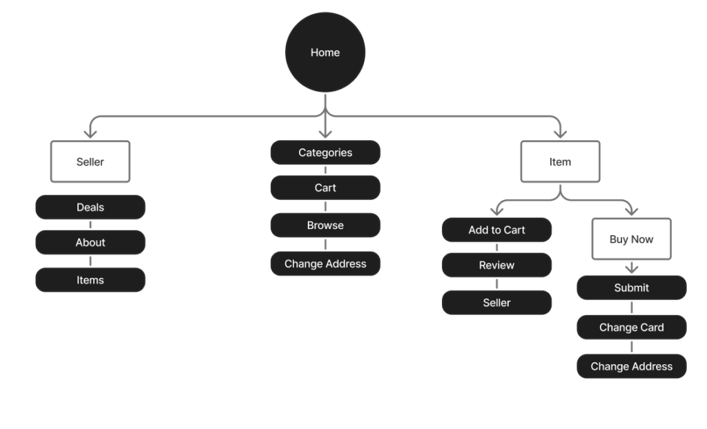
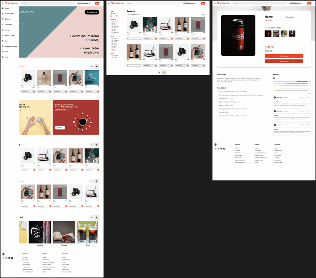
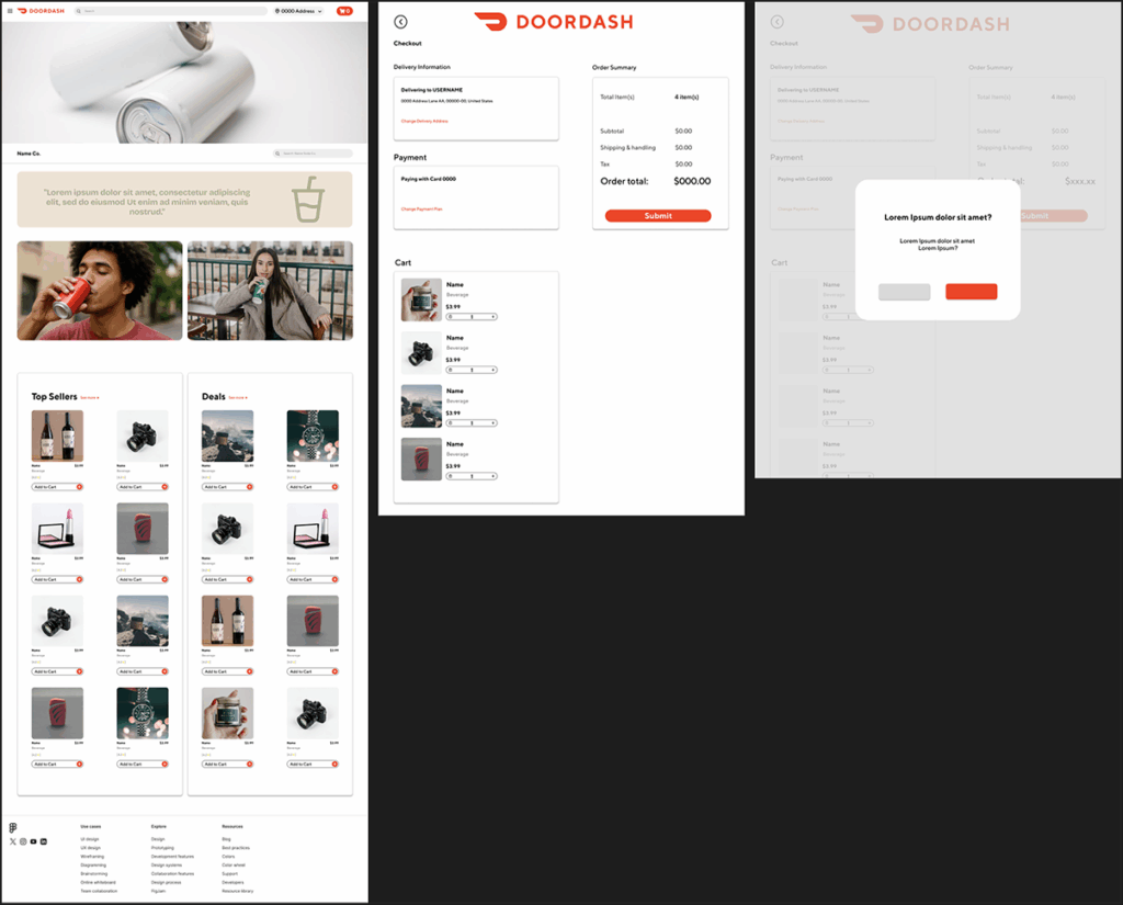
Marketplaces often contain a wide range of pages and interactive elements, so maintaining a clear visual hierarchy and straightforward navigation was essential.
The user journey was intentionally designed to be simple and intuitive, allowing users to reach most pages within two clicks. Repetitive sections were streamlined to improve consistency and reduce cognitive load, resulting in a cleaner, more efficient experience.
Design Outcome
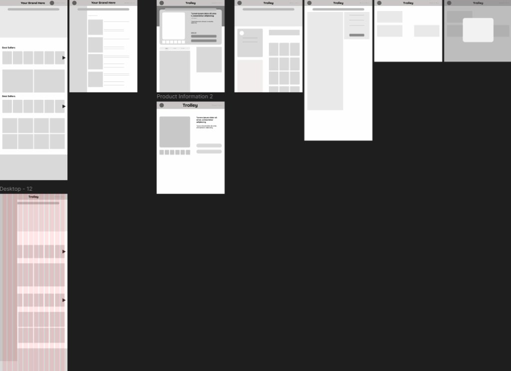
The wireframe was constructed using a 12-column grid with 60 px margins and 20 px gutters, which is a standard layout commonly used in DoorDash and its related web properties.
The marketplace design adopted a more modern interpretation to appeal to the target audience of Discord users. Special attention was given to key areas such as product reviews and category selections to ensure they were both visually prominent and easy to access, maintaining a balance between structure, usability, and aesthetic appeal.
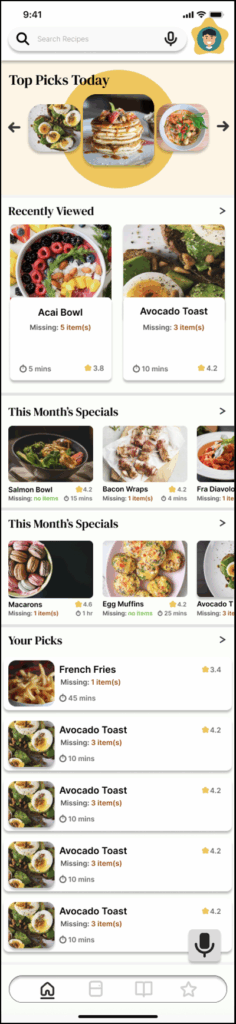
OverEasy is a mobile app concept that reimagines the cooking experience by helping users stay organized and reduce food waste. The goal was to design a tool that not only simplifies cooking but also promotes a decluttered and efficient home.
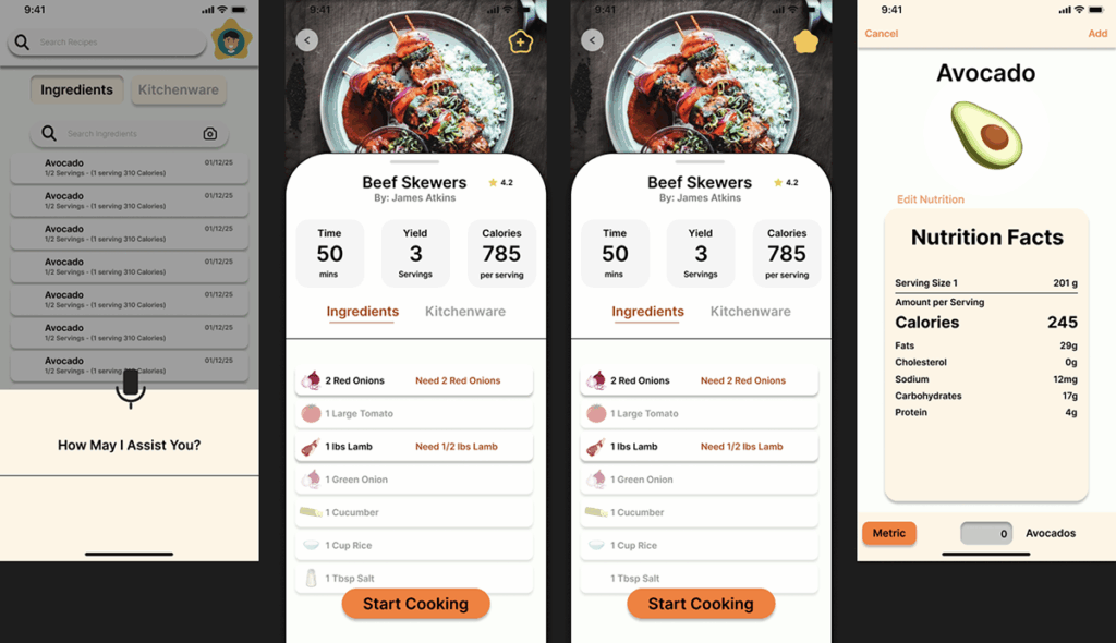
The app introduces a feature that encourages users to use ingredients that would typically go unused, helping them better understand and manage what they already have in their kitchens.
Problem Space
Cooking has become deeply embedded in modern culture, especially with the explosion of food content across social media platforms.
This shift has made traditional recipe apps feel stagnant and less adaptable to the needs of today’s users. With so much free and engaging content readily available online, conventional cooking apps often struggle to show any value.
OverEasy was designed to bridge that gap by creating a dynamic, personalized experience that goes beyond static recipes and helps users engage with their kitchens in more meaningful ways.
Title Branding
OverEasy was developed with the core concept of ease both in name and visual identity. The name draws inspiration from the term over easy, referencing a style of cooking eggs that naturally evokes simplicity, comfort, and familiarity. The name’s approachable tone reflects the brand’s goal of creating an effortless and inviting experience for its audience.
Logo Branding
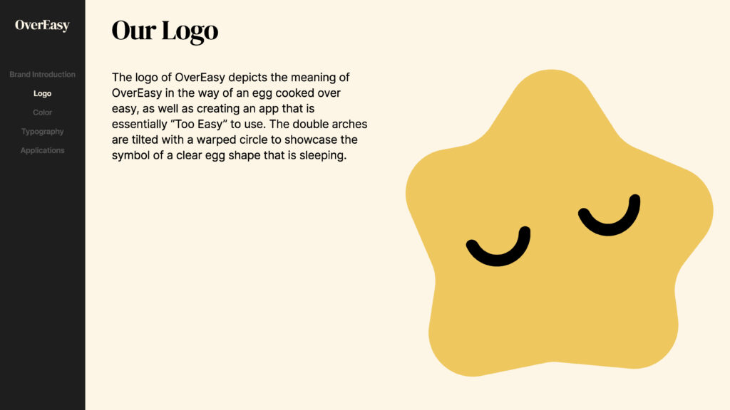
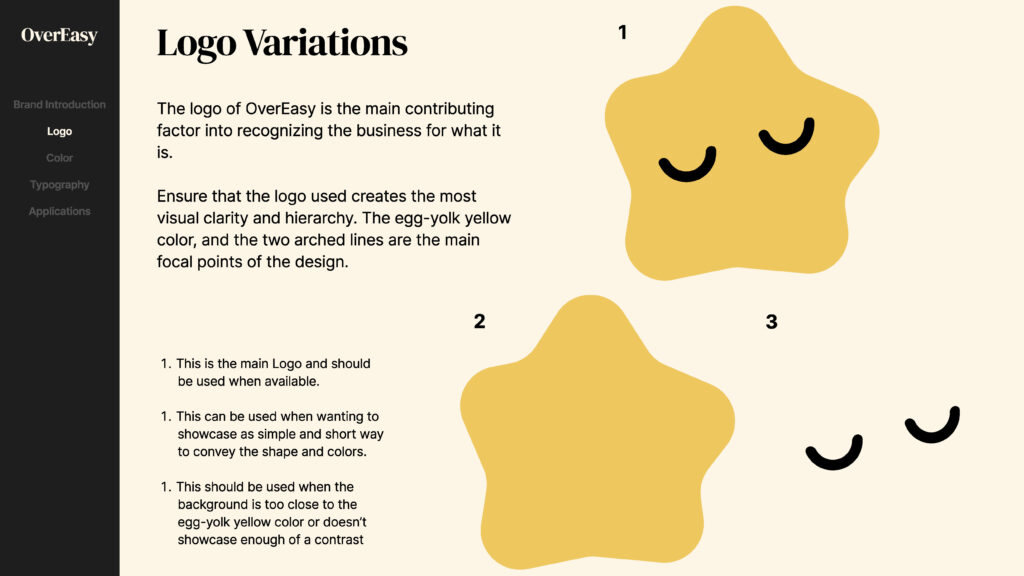
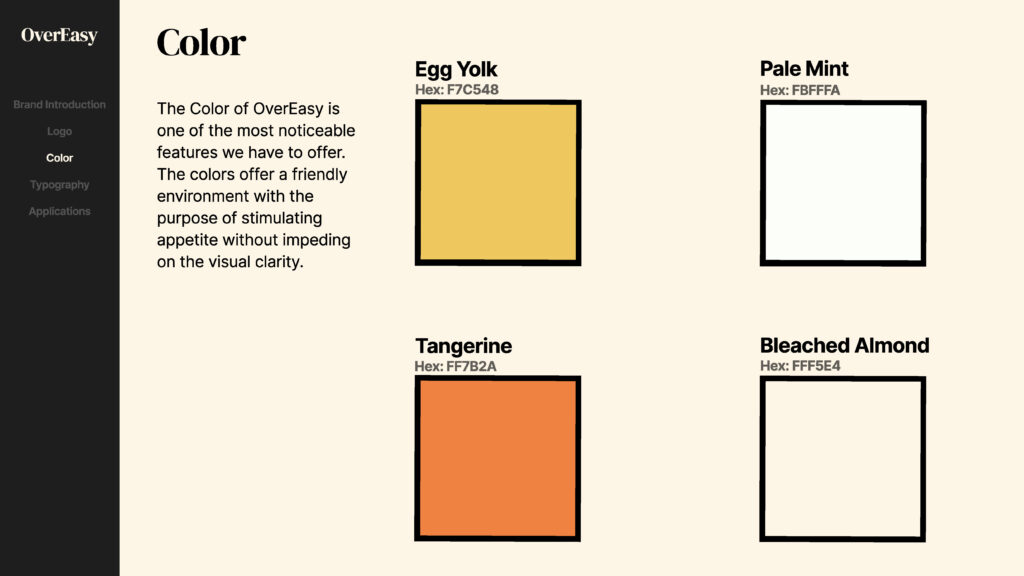
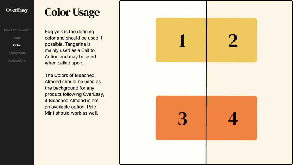
The logo was designed to embody the same sense of simplicity and warmth. Research on color psychology guided the selection of red, yellow, and green hues known to stimulate appetite and evoke positive associations with food. Yellow was ultimately chosen as the dominant color to reinforce both the egg reference and the brand’s optimistic, approachable character.
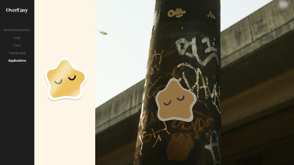
The minimalist egg-shaped logo uses as few lines as possible to maintain clarity and ease of recognition. Its form was subtly inspired by Gudetama, the Japanese character known for its relaxed and relatable personality, reinforcing the brand’s playful yet calming tone.
// Experience System //
Competitive Analysis
Paprika
Big Oven
Yummly
Pantry tracking
Has an integrated pantry list
Basic List
None
Recipe Suggestions on pantry
No Suggestions Given
“Use up leftovers” Style
None
Recipe Importation
Supported
Supported
Partial
User Interface
OK contrast and UI
Lacking, shown to be biggest complaint
Polished UI
Pricing
One time fee
free + premium features
free + premium features
User Experience
Although easy to use, many clicks to reach intended points
Easy to use and few clicks needed
Some clicks are used to reach a few intended points
Qualitative Insights
Participants
8 Individuals
Various Age Groups
Various skills/knowledge in cooking
To better understand user behaviors and pain points, I conducted interviews with 8 participants across various age groups. Each participant was asked whether they had used a cooking or recipe app within the past year, and if not, why.
Most users reported that they no longer rely on dedicated cooking apps. Instead, they find recipes through search engines or social media platforms. The main reasons included lack of personalization, redundancy, and unnecessary complexity. These insights guided the direction of OverEasy toward simplicity, relevance, and integration into existing cooking habits.
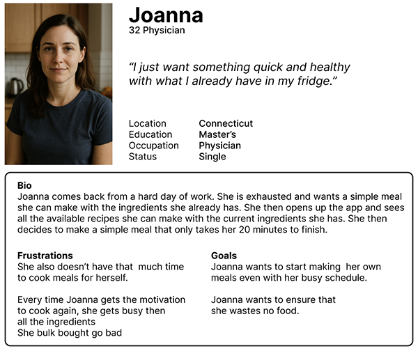
Persona #1
// User Interface //
Ideation
Many premockups were drawn up to integrate the necessary components without overwhelming the user with unnecessary clicks or tasks.
Since the app introduces new apps or tabs that are unique, it was important to convey that message without forcing the user to read a manual instruction simply to use my app.
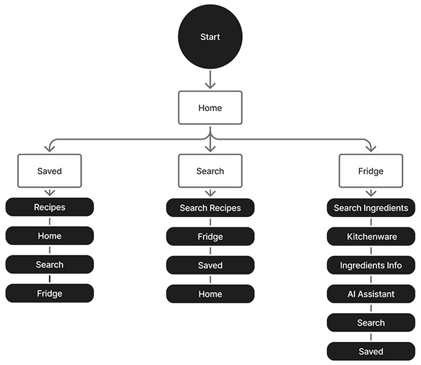
User Flow & User Journey
In order to create a seamless flow throughout the app, it was imperative to the users journey to identify the differences between the key tabs and the secondary tabs. Creating a clear hierarchy let me give spotlight to the features that made this cooking app different from competitors.
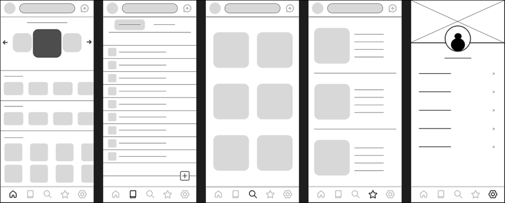
Wireframe
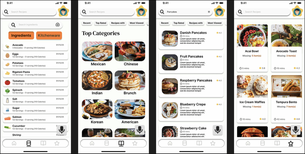
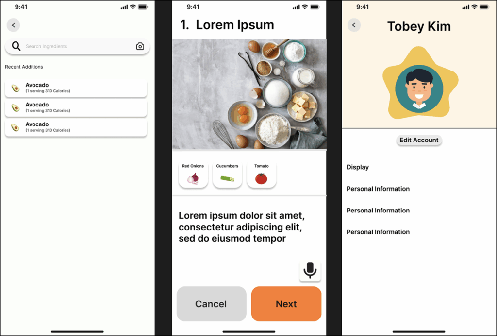
The initial wireframe established the foundation for the app’s core structure, outlining the five key screens: Home, Fridge, Search, Saved, and Settings. It provided a clear visual framework for how users would navigate the interface and interact with essential features. This stage was crucial in defining the hierarchy of information, ensuring intuitive flow, and setting the groundwork for consistent layout and user experience throughout the design.
Prototype – Problem
Early prototype testing exposed multiple areas for improvement in both functionality and visual design.
Visual Design poor color contrast, that used non-accesible Colors
Information Architecture Grouping Inconsitencies. Inconistent visual hierchy
User flow Inconsistent action buttons, too many steps to complete certain paths/tasks
Prototype – Solutions
Several steps were taken to identify and resolve the issues, resulting in a more intuitive and cohesive user experience.
Visual Design The color palette was refined to improve readability and accessibility. Lighter background tones were introduced to enhance contrast with black text, creating a cleaner and more balanced interface.
User Flow Navigation paths were simplified and optimized, allowing users to reach key tabs more quickly and efficiently. This streamlined the overall experience and reduced unnecessary steps in the journey.
Pain Points Interactive elements were redesigned with clearer buttons and more intuitive actions, enabling users to complete common tasks faster and with less friction.